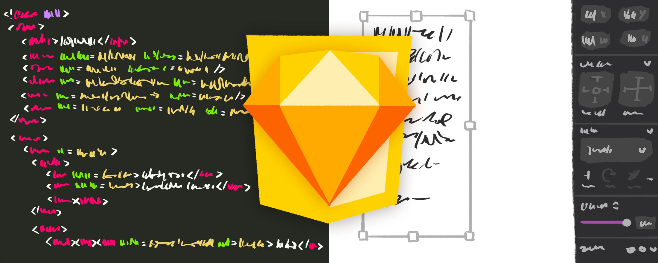
On one hand, coding a design using HTML & CSS makes perfect sense: software is written with words, and it follows that software’s user interface should also be written with words. As websites have evolved further away from tables and increasingly toward component-ized Javascript apps, design-as-words has allowed for great interconnectivity between logic and presentation, with all sorts of cool tricks and efficiencies made possible by unifying the tools used to create both.
But on the other hand, coding designs using HTML & CSS is totally unintuitive: hearing a description of an image is decidedly not the same as viewing the image. Absurd as that analogy sounds, it’s not too far off from the reality of writing code to describe a website’s design. Imagine recording a song with code, or editing a video with code—possible, certainly, but perhaps not the first (or tenth) approach a creator would likely turn to.
However, though the visual feedback that graphics editors offer is a more natural approach to design than using a text editor, the eccentric nature of designing-with-words reveals several powerful features that are likely absent from your graphic design workflow. Learning about the process a front-end developer uses to translate a visual design into code can help you collaborate better, manage details consistently, and easily modify past work.
In this article, I will walk you through various features of Sketch which mimic the process of coding a website, using this mockup of a video carousel from cleancoders.com as an example.

Since this article is not a tutorial for how to create a mockup in Sketch, let’s begin at the end, with the finished mockup:
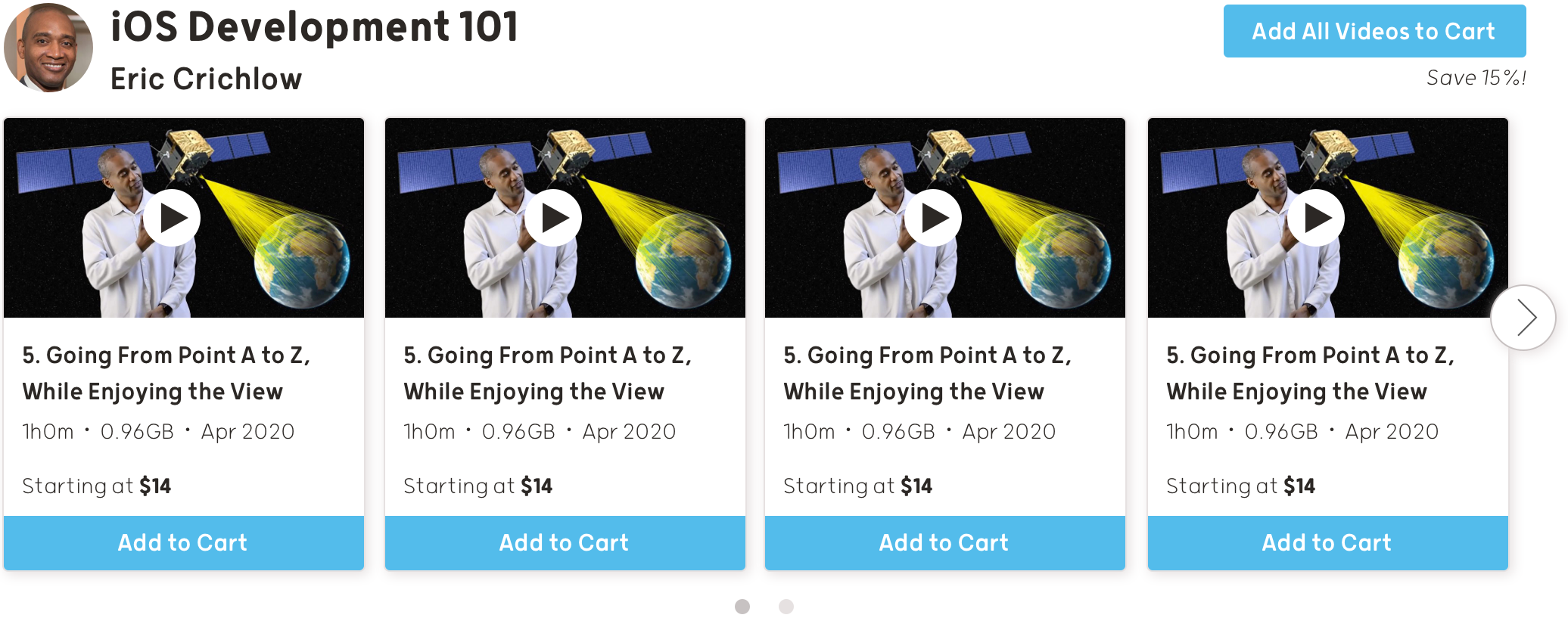
Even though I totally cheated by copy/pasting the video tiles, I’m done, right? My intent should be obvious to everyone, without needing to manually edit each tile with unique content. However, despite the strong urge to just ship it, this is the point in the design process where I can make improvements to help the front-end developer...and more importantly, my future self.
Collaborate Better with Organized Layers
Even if you won’t ultimately write the code for your mockups, a basic understanding of HTML will allow for your design to more easily translate to the web, and look more natural to boot. This mode of thinking starts at the very beginning of the design process, so let’s step back in time and look at the wireframes.
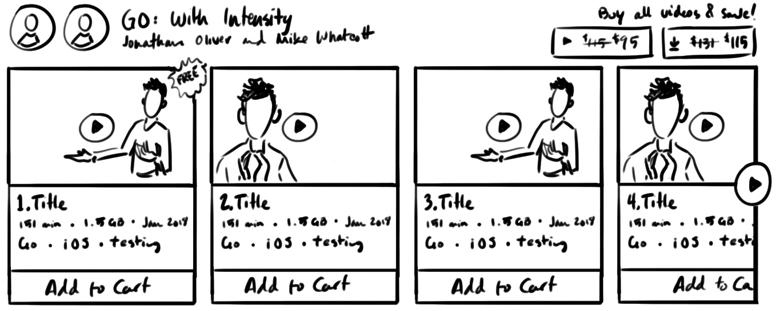
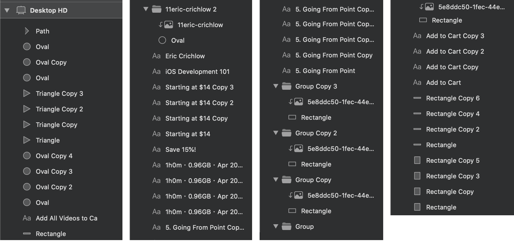
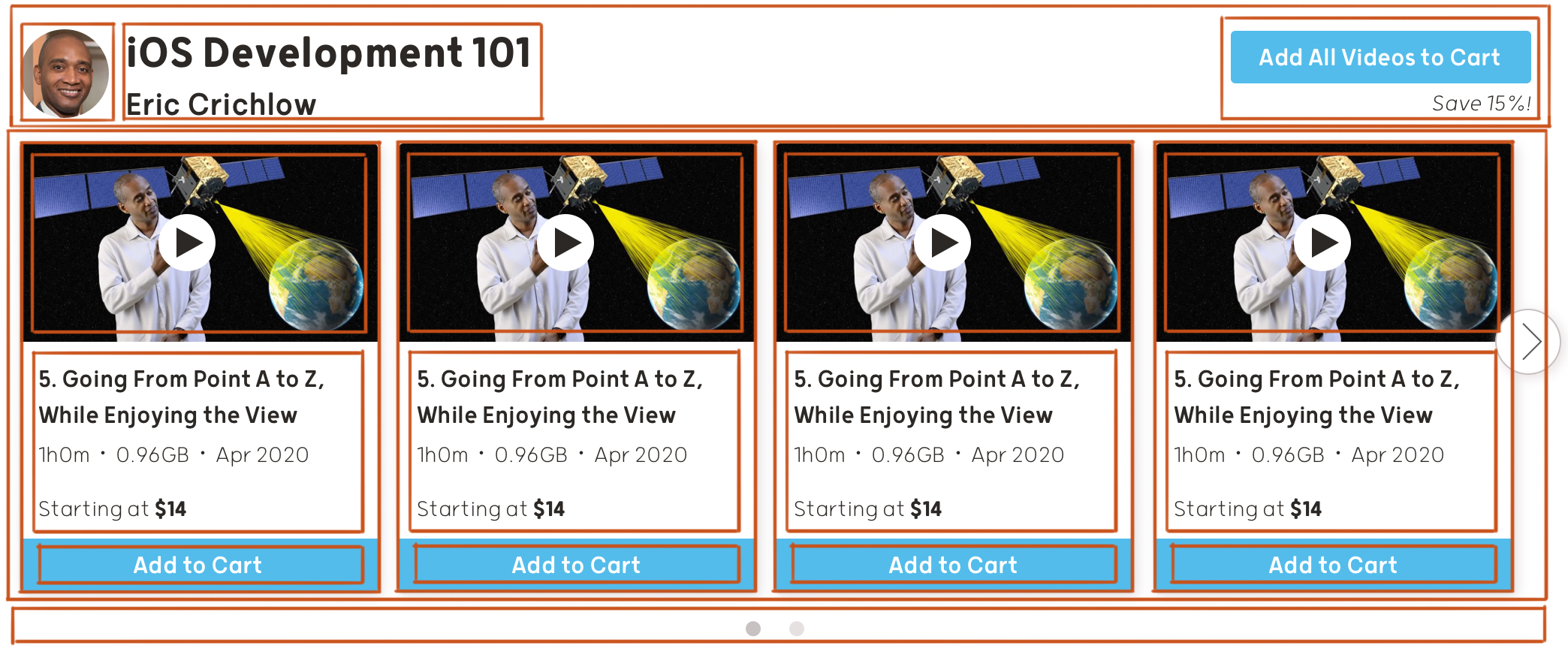
This is the original wireframe I drew when designing the Clean Coders website, so a few details are different from the final screenshot above (notably the “add all to cart” area in the upper right), but the majority has remained intact. Even though the coding step couldn’t be farther away, I am still thinking about how to organize my sketch into HTML at this point, and so should you. Fortunately, this type of organization doesn’t require you to be good at HTML; you only need to be good with folders. Here is how I would visually organize the components of this design into groups:
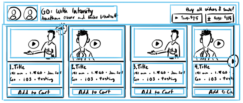
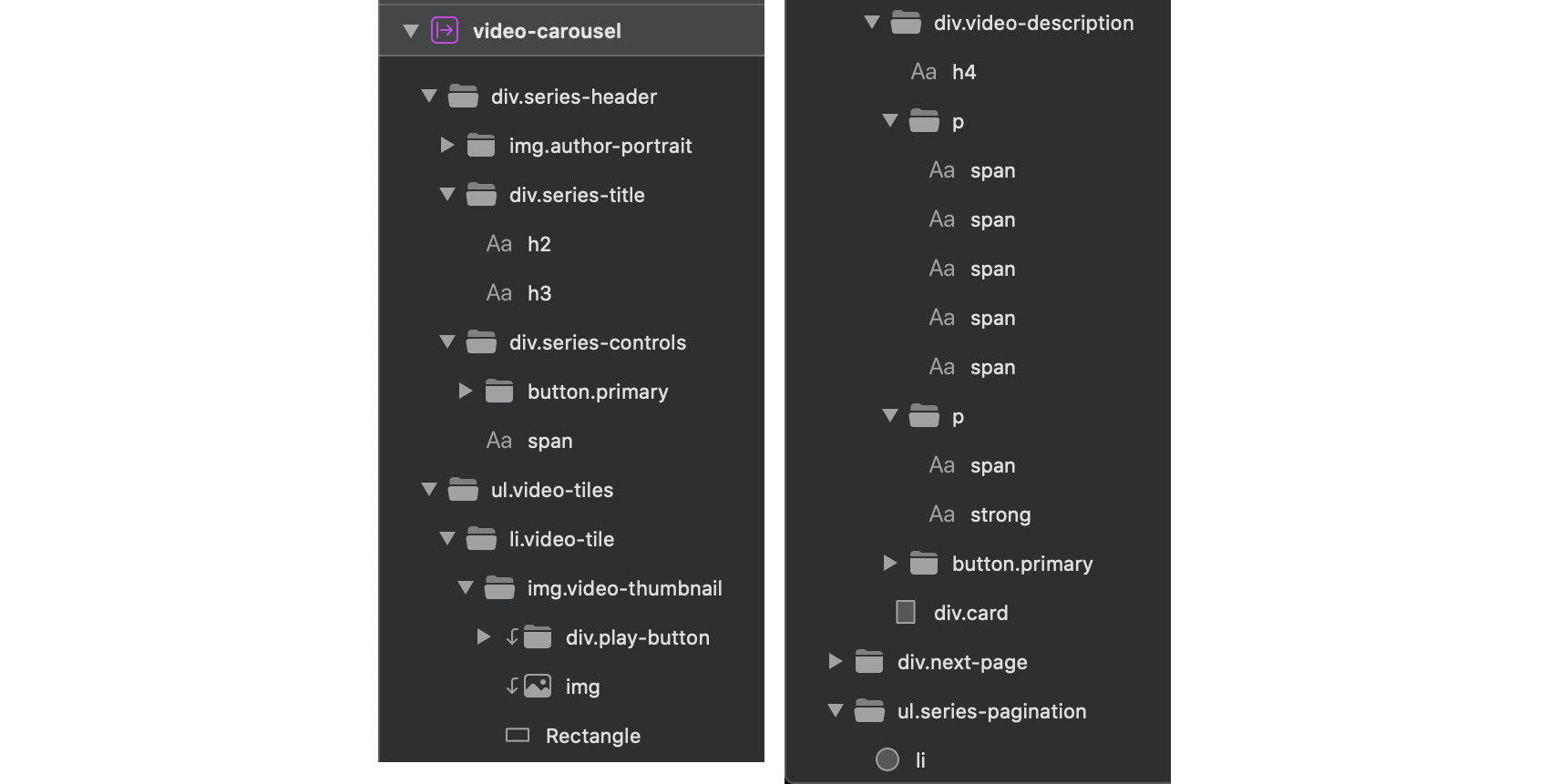
Two top-level folders contain all of the content in this image: the top bar containing information about the video series, and the list of video tiles below. Within the header folder, I have further grouped information by type into three chunky columns, and the video tiles are similarly sorted into one column per video. Within each video tile folder, I have separately grouped the thumbnail, details text, and the add to cart button.
When sketching wireframes, my top priority is creating a design that can be easily sorted. If I can visualize how to nest my design into folders, then I can just as easily visualize how to nest my design into HTML…
...And into groups in my layers panel. Currently, this is what my layers panel looks like:
Perhaps I am technically finished, but this will not be a fun project to resume in a month’s time, when I’ve lost all context on the progress I’ve made. Furthermore, what about the developer to whom I will hand off my Sketch file? Fortunately, with a very small amount of effort I can organize my work for two different people simultaneously.
Let’s revisit the groups I identified in my wireframe:
If I were to write HTML to describe this content to a web browser, it would look like this:
<div class=”video-carousel”>

  <div class=”series-header”>
    <img class=”author-portrait”>
    <div class=”series-title”>
      <h2>iOS Development 101</h2>
      <h3>Eric Crichlow</h3>
    </div>
    <div class=”series-controls”>
      <button>Add All Videos to Cart</button>
      <span>Save 15%!</span?
    </div>
  </div>

  <ul class=”video-tiles”>
    <li class=”video-tile”>
      <img class=”video-thumbnail”>
      <div class=”video-description”>
        <h4>5. Going From Point A to Z, While Enjoying the View</h4>
        <p>1h0m • 0.96GB • Apr 2020</p>
        <p>Starting at $14</p>
      </div>
      <button>Add to Cart</button>
    </li>
    -- more video tiles go here --
  <ul>

  <ul class=”series-pagination”>
    <li></li>
    <li></li>
  </ul>

</div>
Even if you’ve never written a line of code in your life, you should notice some similarity between the mockup and the code. Each indentation denotes a deeper level of nesting in the folder structure, and the name of the folder can be found in the class names. For instance, in the example below, the “div” element is like a folder which contains two pieces of data—the series title and author.
<div class=”series-title”>
  <h2>iOS Development 101</h2>
  <h3>Eric Crichlow</h3>
</div>
Applying this method of sorting to Sketch yields the following groups in the layers panel:
To be clear, this level of precision in the layer and group names is extra credit. Any clearly-labeled list of groups is better than my first example, and sorting layers into hierarchical groups is enough to both please a front-end developer and prepare us for the next step...
Manage Details Consistently with Symbols
Though graphics programs are more intuitive to use than writing HTML & CSS, modifying existing designs in Sketch or Photoshop can be more cumbersome than coding if your file is not properly prepared. One disadvantage of graphical editors is difficulty in preserving a style through copying and pasting. My design for this video carousel calls for repetition of video tiles, and though this is a simple element of a simple mockup, each mismanaged discrepancy will compound upon itself the more often it is repeated. Of my many missteps as a designer, inconsistent margins, spacing, and alignment have cropped up in previous projects despite my best efforts to measure, measure, measure, measure with each copy and paste. Without realizing, my inconsistencies have delegated design decisions to a developer, asked by my sloppiness to “just eyeball it.”
Symbols are a powerful feature of Sketch that wrangles repeated elements of a design by mimicking the functionality of CSS. CSS applies the same style to all elements of a shared name, and Sketch can similarly target groups for reuse. Neatly organizing your design into symbols offers more efficient workflow to you as the designer, as well as to the developer who will inherit your work.
To create a symbol, first select a group. I’m going to start by turning the video carousel into a group, since this element is used many times on the website.
Next, choose Layer > Create Symbol from the menu bar.
Sketch has teleported me to the “Symbols” page, where I now see the video carousel.
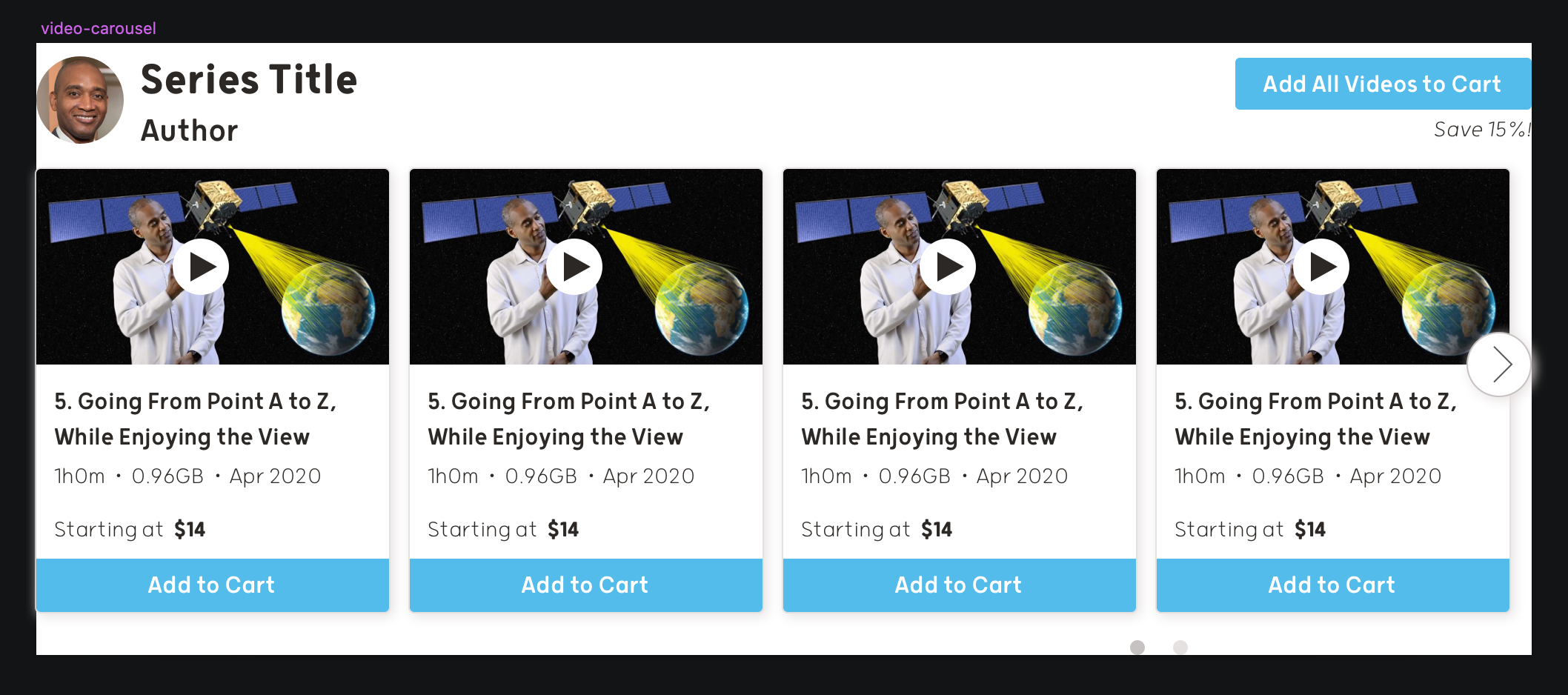
Back in the page where my original mockup lives (“Page 1”), from the menu bar I can select Insert > Symbol / Document > video-carousel to pepper my page with enough video carousels to simulate cleancoders.com.
It looks identical!
On second thought, symbols don’t seem much more useful than before. True, I can more easily and safely manipulate these symbols here than I can in Photoshop, but my mockup is just as lazy as before. If a client requests to see a more accurate portrayal of the final website, I’ll need to detach all of my symbols and undo this work.
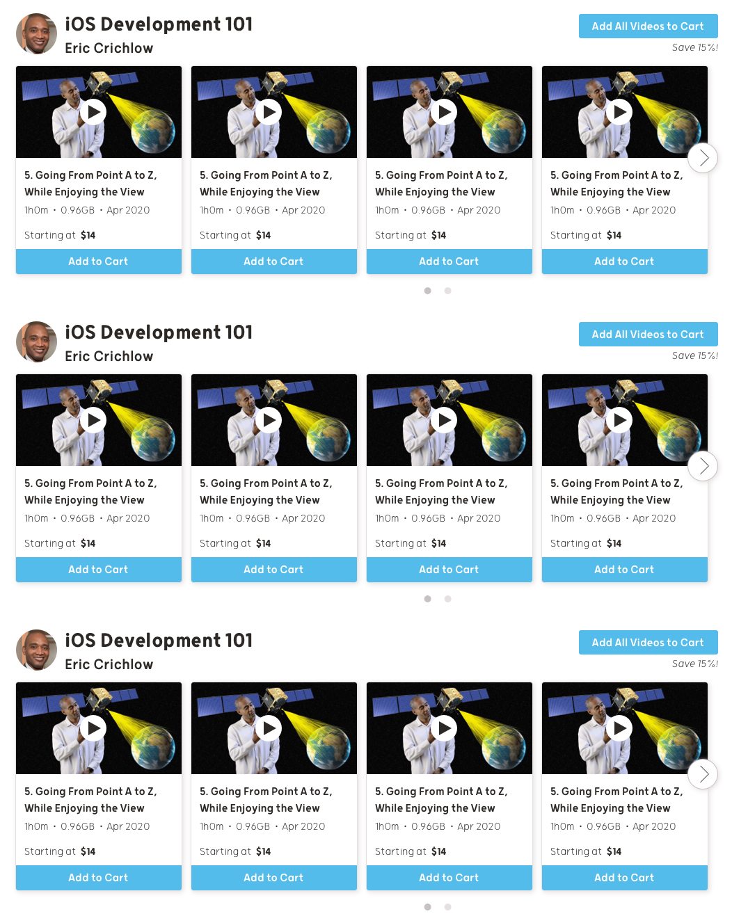
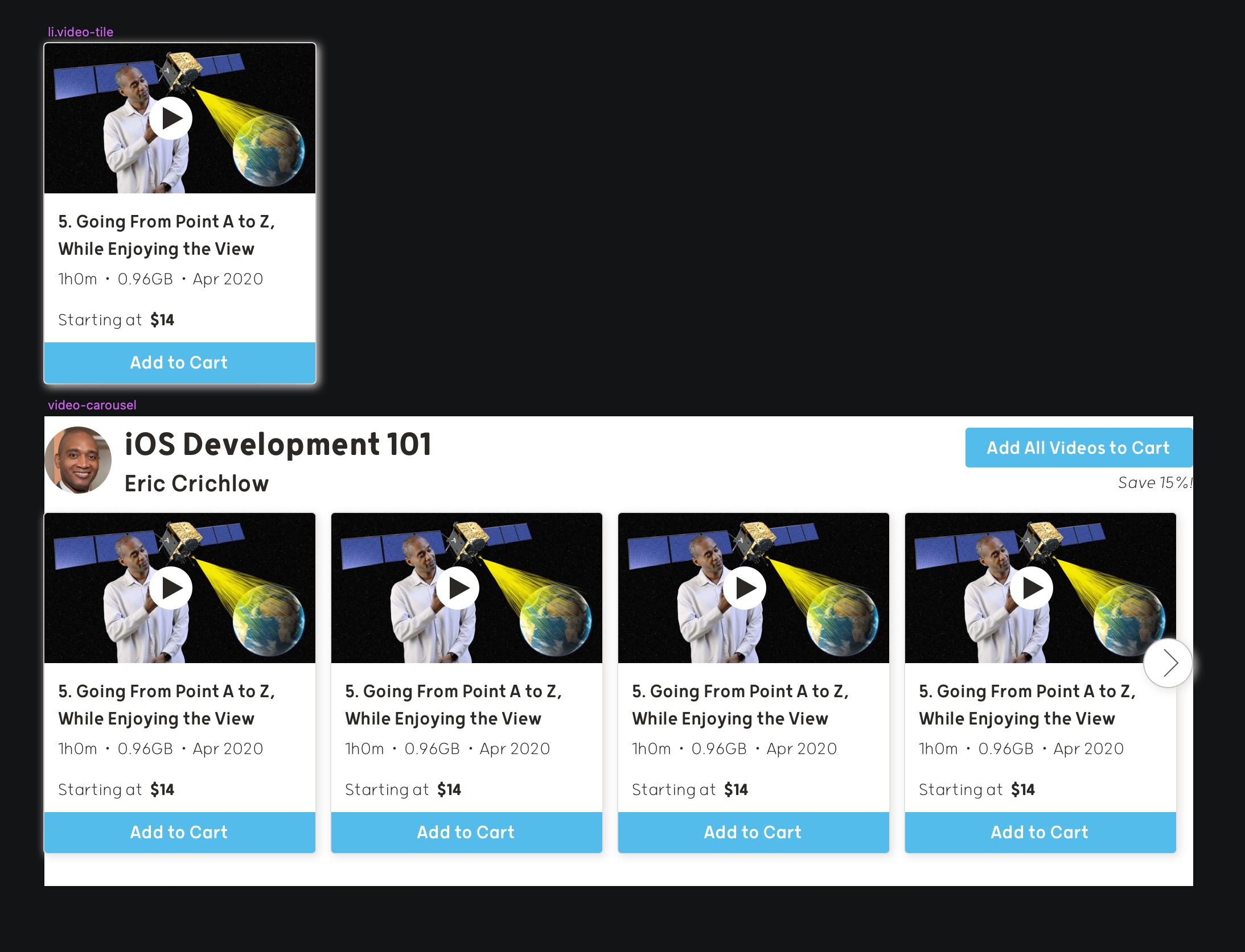
However, the real power of symbols emerges after realizing that you can nest symbols inside of other symbols. From the symbols page, I can select a single video tile, and from the menu bar choose Layer > Create Symbol to designate this group as a new symbol.
After replacing all of the tiles in the video-carousel symbol with video-tile, my symbols page now looks like this:
This still seems like only a minor improvement over having no symbols at all, but its most important benefits will be realized in the next step...
Easily Modify Past Work with Symbols and Overrides
The bane of my existence is “doing things I have already done.” I curse my own name whenever Photoshop crashes and I haven’t saved my work, and I flip tables when I need to increase the font size of 600 separate text boxes one at a time. One of the flagship features of HTML & CSS is the ability to simultaneously update large swathes of code with minimal keystrokes, and it is a boon that Sketch’s symbols were inspired by this workflow.
The most obvious application of this feature is to update all instances of a symbol at once. As an example, I decided simplify the content to a description, and center the video title:
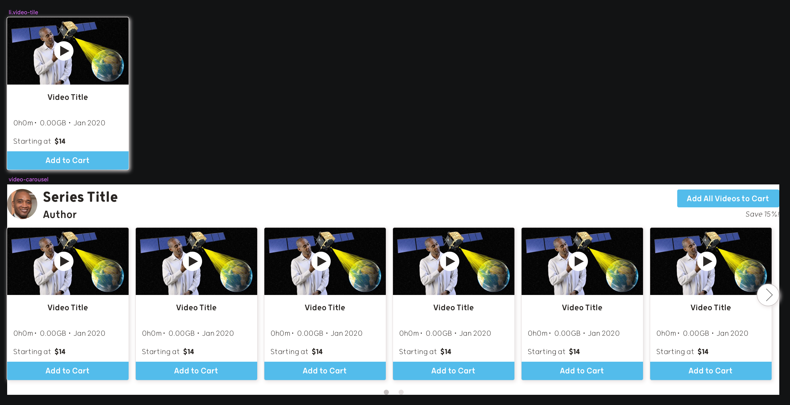
How simple! Any time I need to change this symbol, I need only do so once. However, what if I want my mockup to show a different video thumbnail for each tile?
Since changing a symbol affects all instances of that symbol, this feature is starting to seem like a disadvantage. Didn’t we begin this article with a repetitive mockup? The most satisfying twist of all is that the work to accomplish this is already done—I need only reap the rewards of my labor.
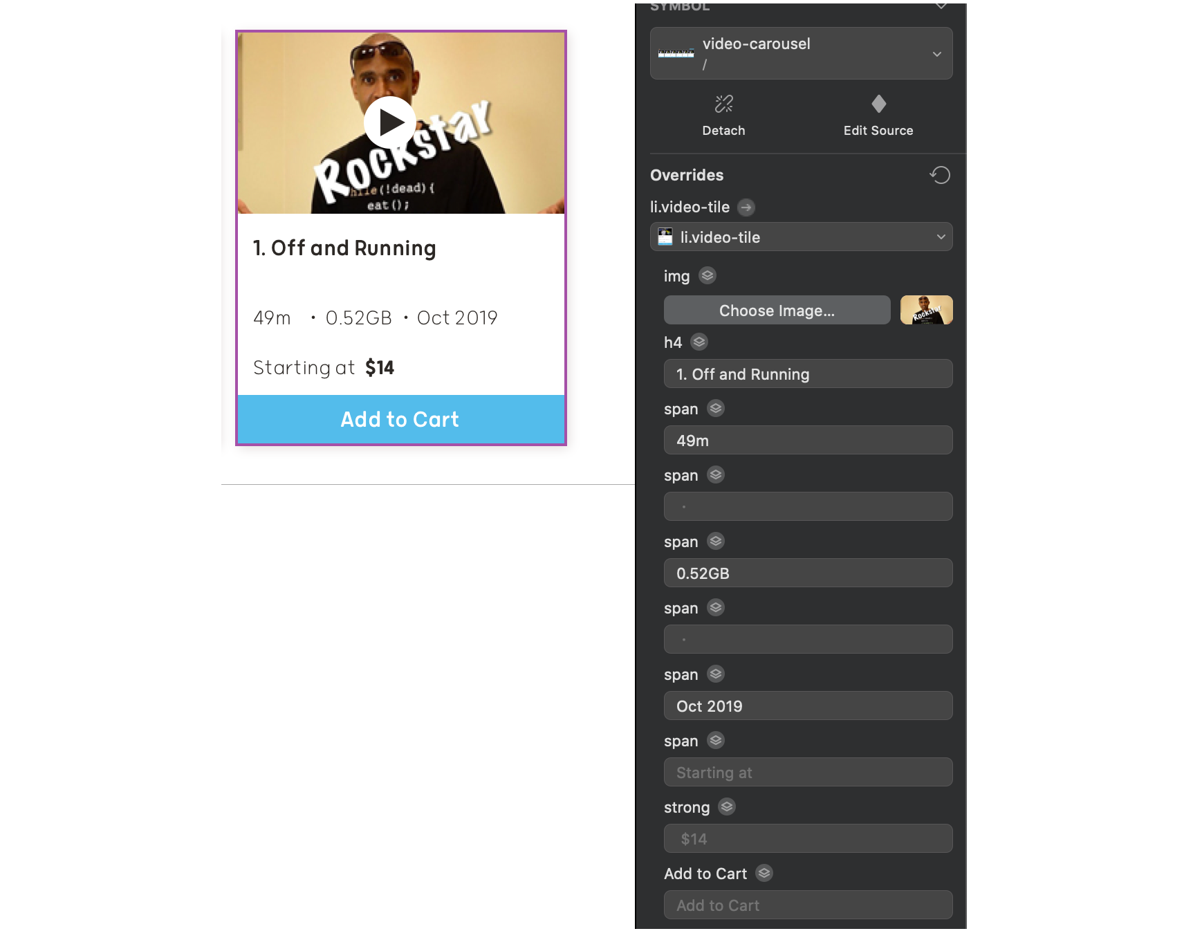
On the page for my mockup (not the symbols page), clicking on any instance of a symbol reveals the following controls in the sidebar on the right:
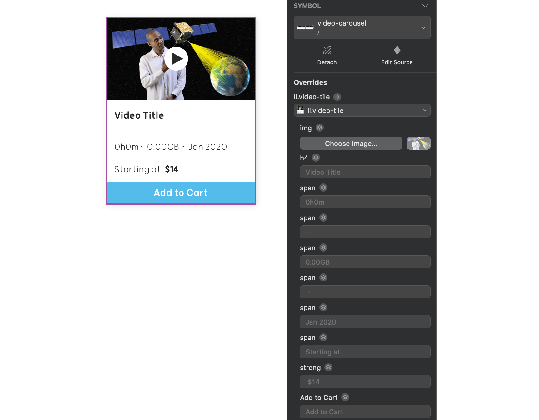
Each field corresponds to a layer in the symbol:

Each field’s header is named after its corresponding layer, and its placeholder text is the text of that element in the symbol. (In my example, the placeholder text for “h4” is “Video Title,” which I intentionally changed from “5. Going from Point A to Z…” for this purpose.)
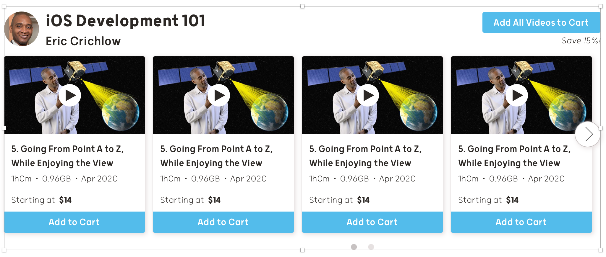
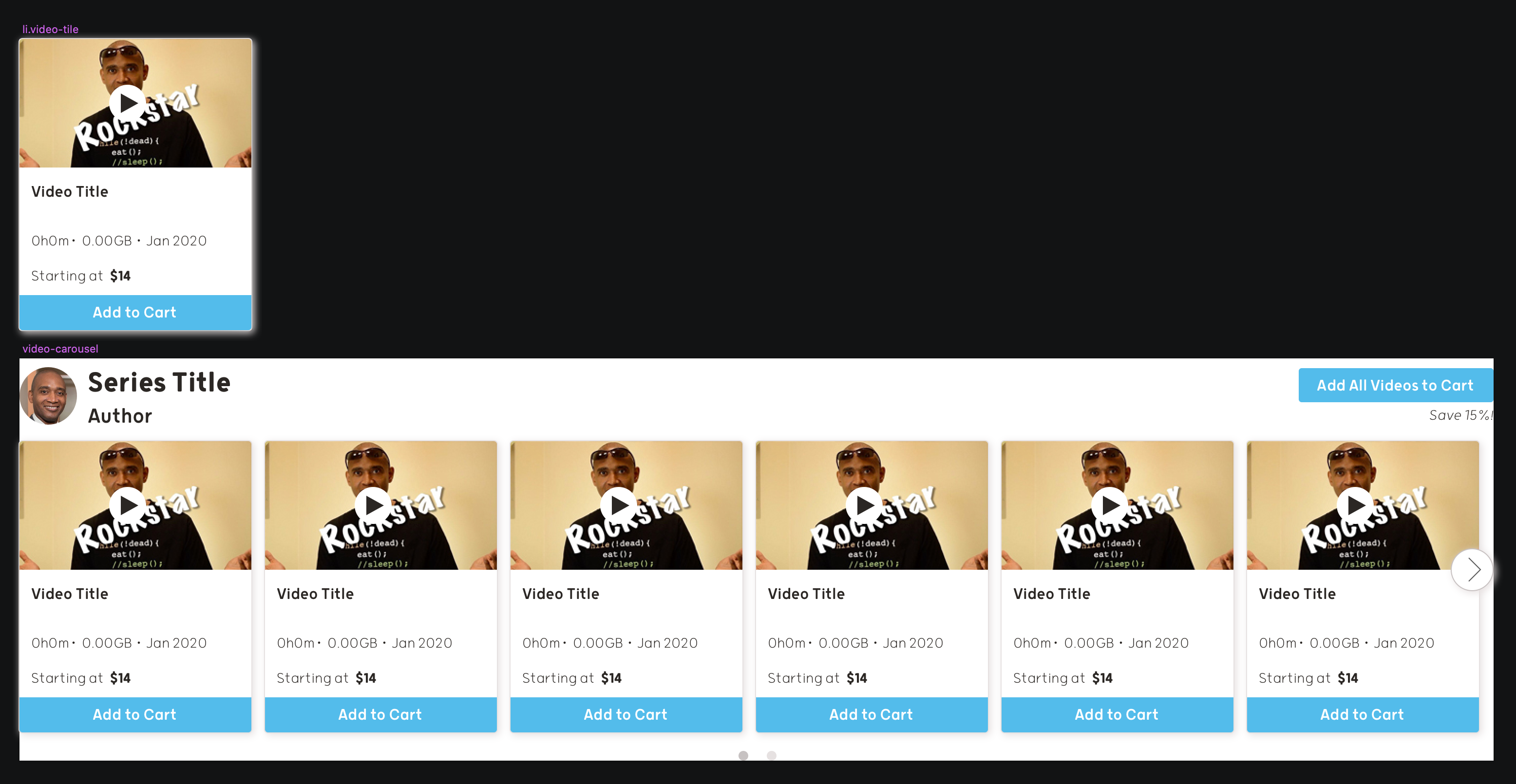
Here is my final mockup. It looks just like the screenshot!

Wrapping Up
The most efficient design workflow seats the same person in both the designer chair and the front-end developer chair, but with a little knowledge you can better bridge the gap between two seemingly disparate roles and make the process easier for each person. Fully utilizing Sketch’s features will help any designer collaborate better, manage details consistently, and easily modify past work, adding up to an improved user experience for everyone.
Stay tuned for part 2, where I attempt to force InDesign to adopt features of HTML & CSS!