In the first part of this series, we examined the intersection of HTML, CSS, and graphics application Sketch, and how writing software as a front-end developer can influence us as designers. In this episode, we will attempt to apply the advantages of HTML & CSS to InDesign. Unlike Sketch, InDesign was created specifically for print projects, and was released in 1999—three years after CSS 1.0 was introduced. Given the world that InDesign was launched into, it makes sense that coding had less influence on InDesign as it did on Sketch (if any at all), and many advantages of a front-end design process are absent from its tools.
Furthermore, the ideal InDesign user is a compiler of content, and not a creator: it is difficult to use InDesign as the author of a novel, a journalist writing a newspaper column, a photographer editing magazine layouts, or an artist illustrating a book, because InDesign is unforgiving with its tools for making changes. To the average user, it appears that any sweeping revisions need to be addressed on an individual basis, demanding painstaking, manual updates to dozens—if not hundreds—of instances, which is not ideal for work in progress. Fortunately, InDesign does offer tools that can save time, and though they are not so obviously connected with the tools of a front-end developer, with a little creativity and imagination this guide presents the first of several novel applications of InDesign's features: frames.
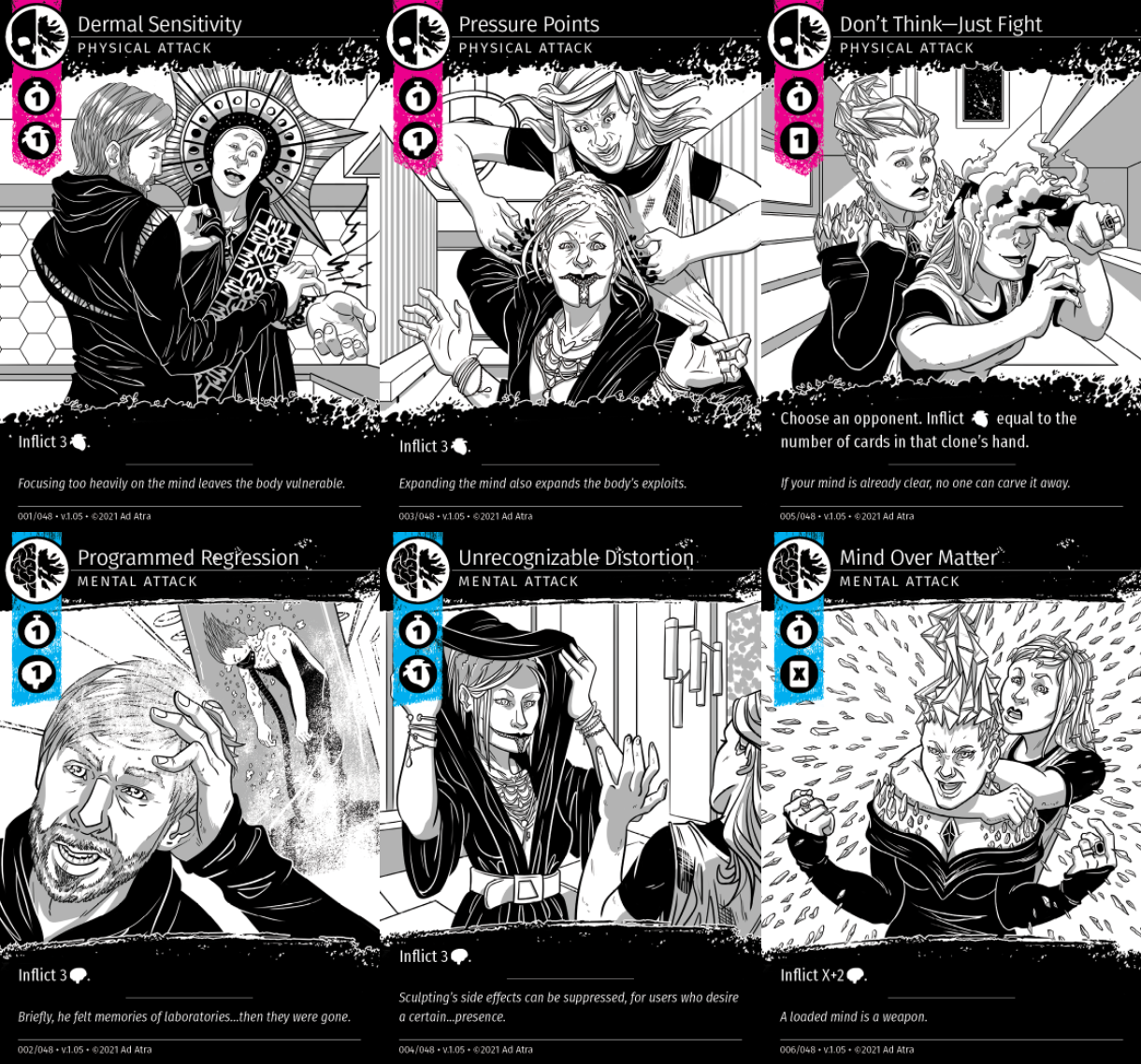
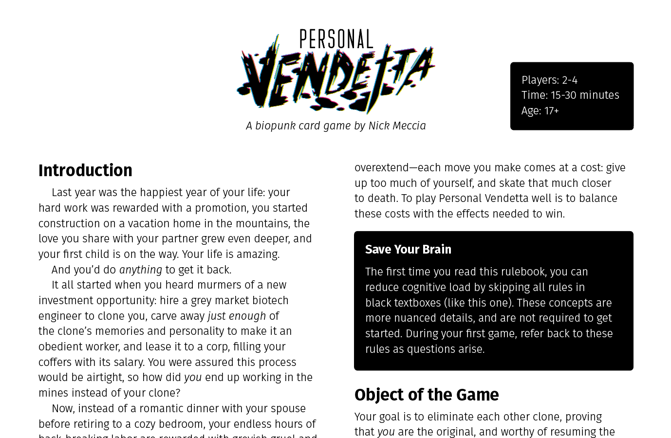
This article will be using examples from my card game Personal Vendetta, which is available as a free print-and-play download from https://ad-atra.com.
The Power of Frames
If you have used PowerPoint, Google Slides, or Keynote, you are probably familiar with the text box—an adjustable and positionable rectangle which contains text.
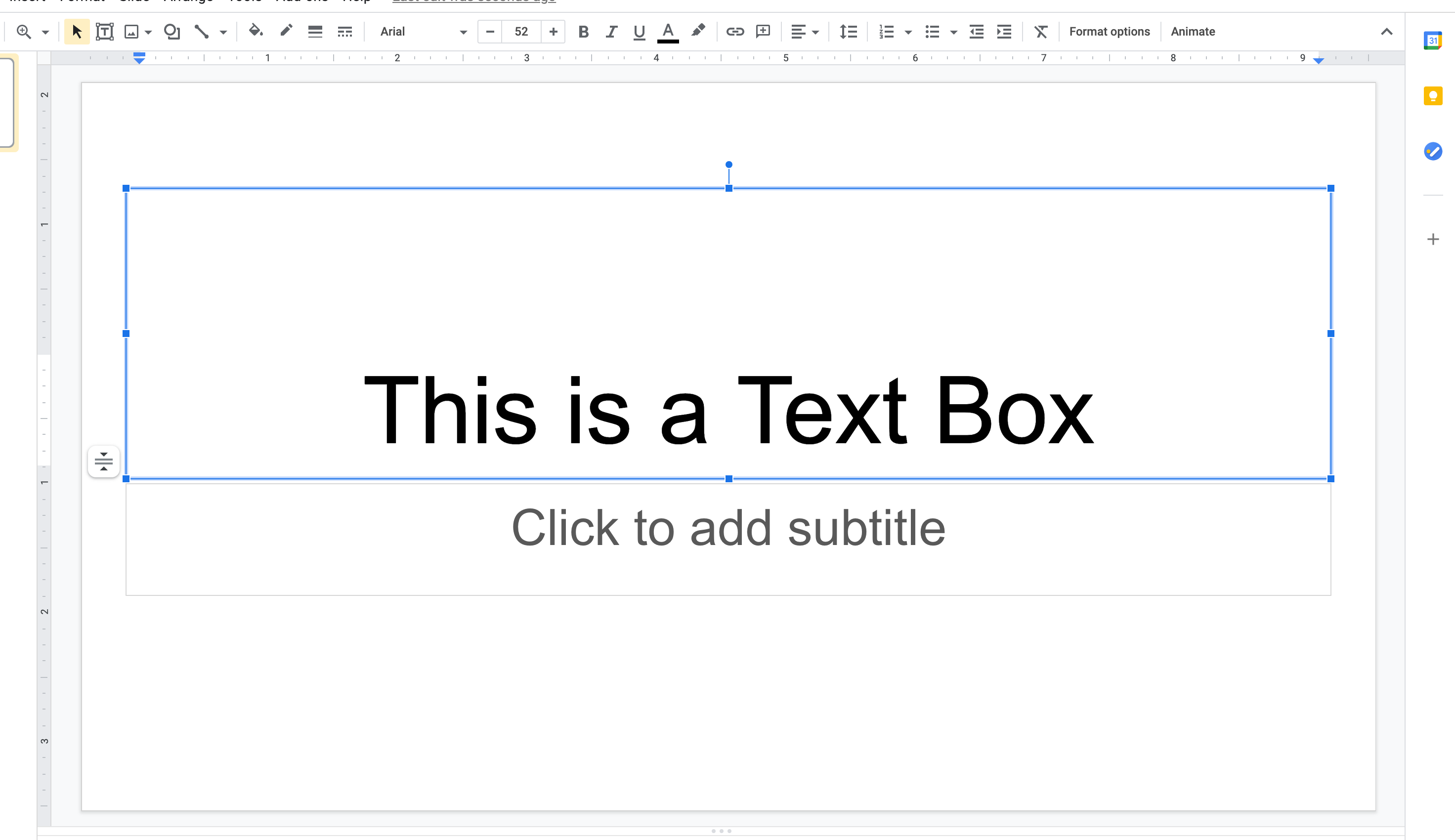
Text boxes allow for greater freedom than a default word processing document by allowing users to easily change the size and position of an area which contains text.
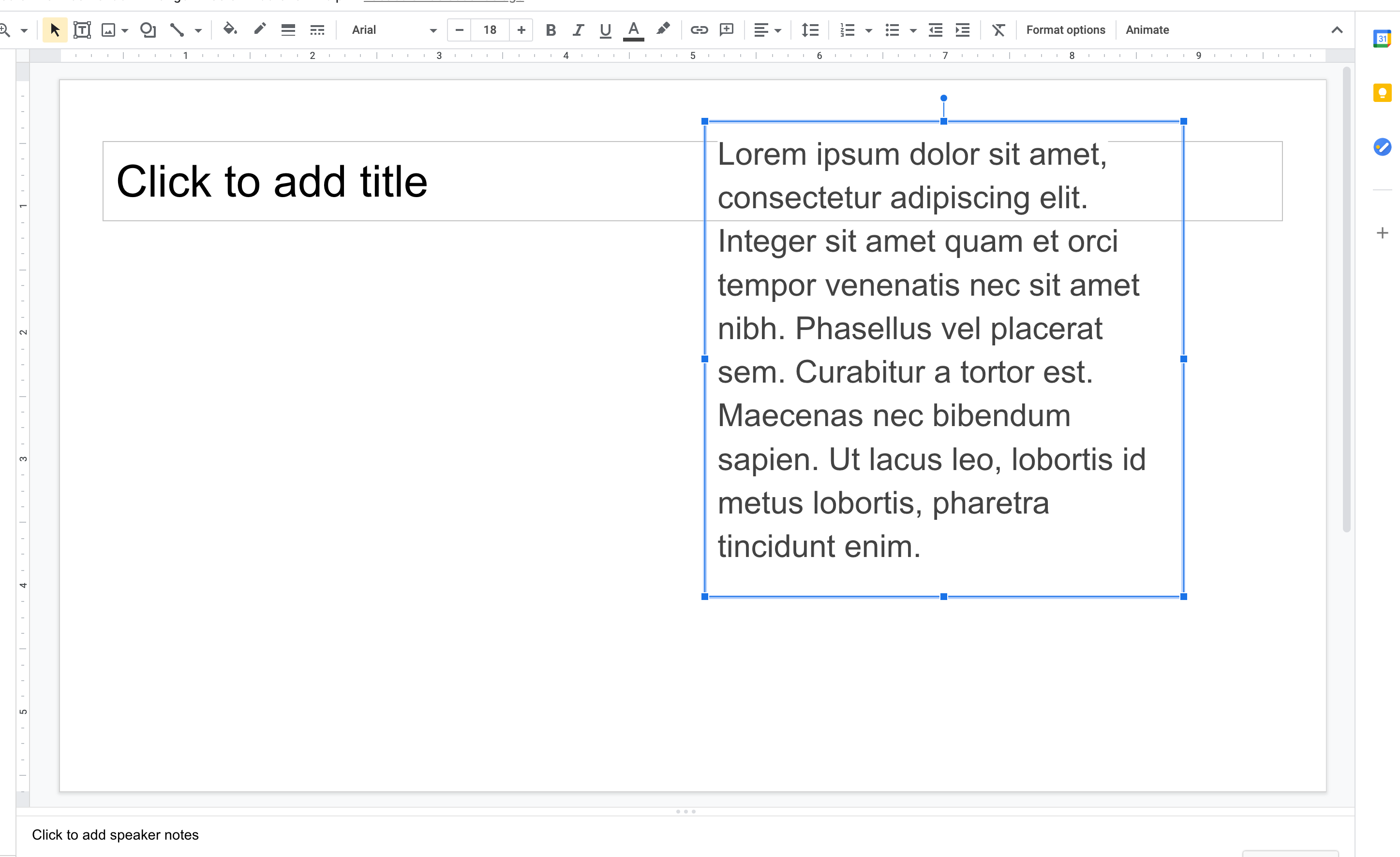
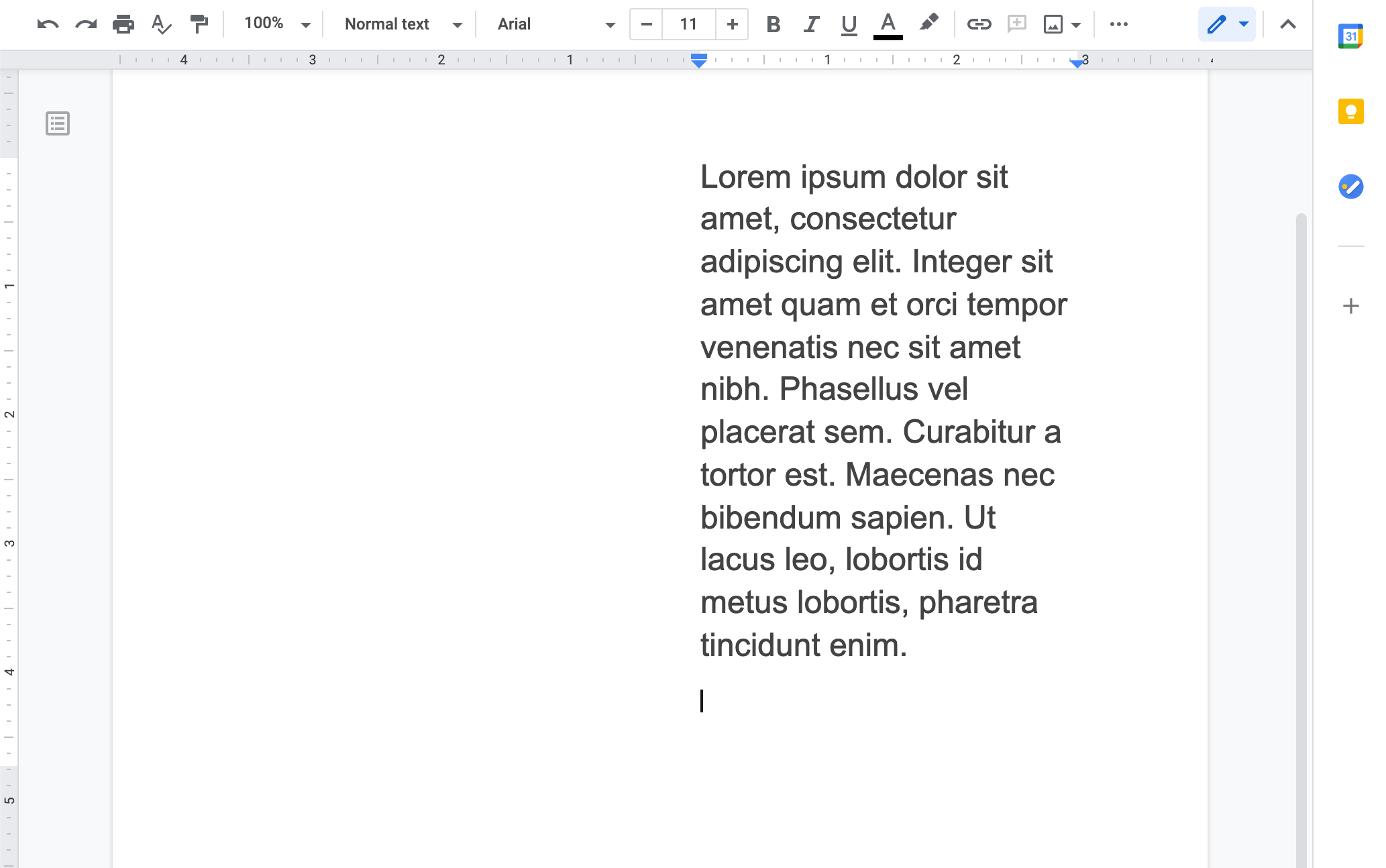
In order to achieve a similar layout in a word processing app, I need to set crazy margins for the entire document. Ridiculous!
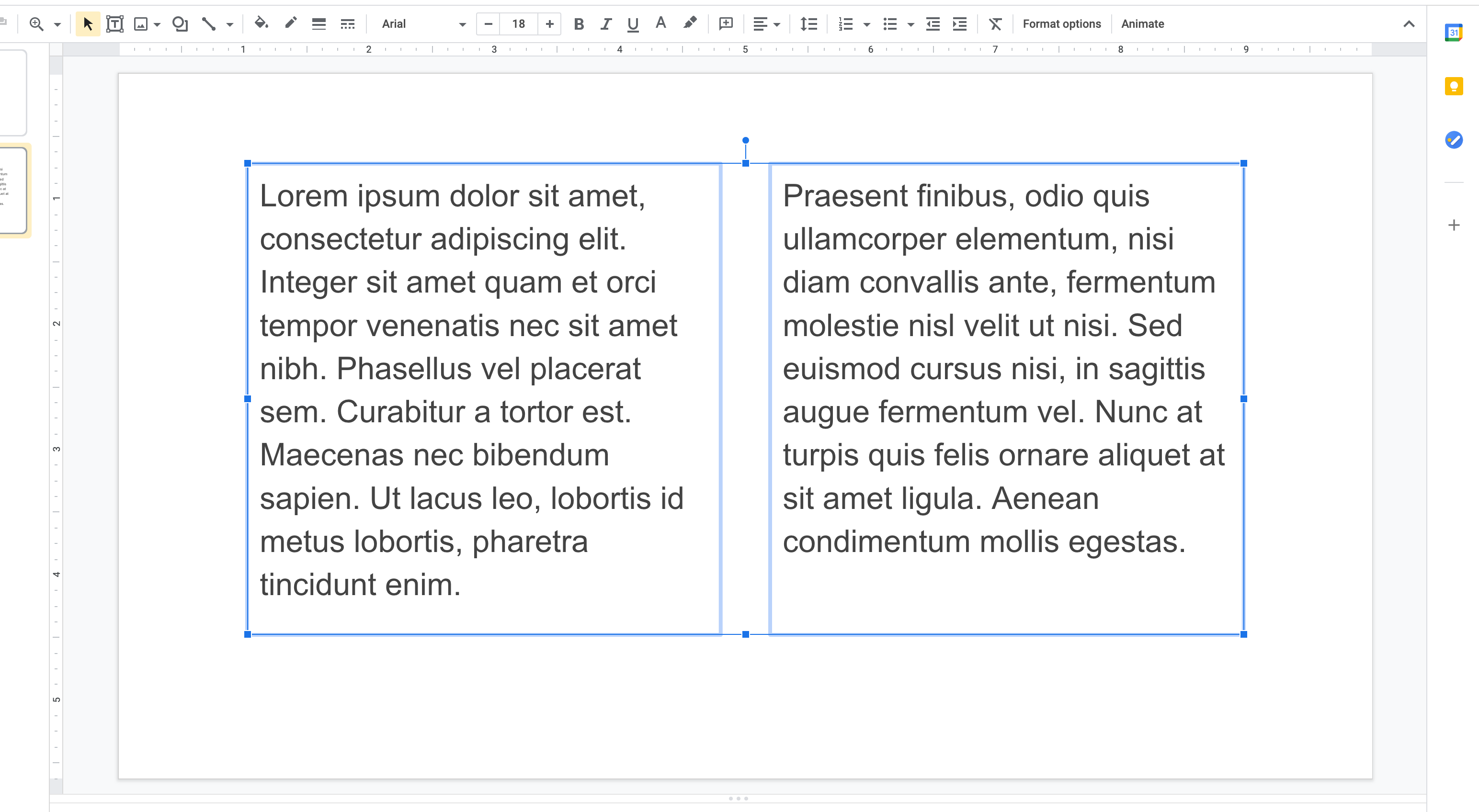
Text boxes are also a more intuitive way to create common layouts, such as multiple columns.
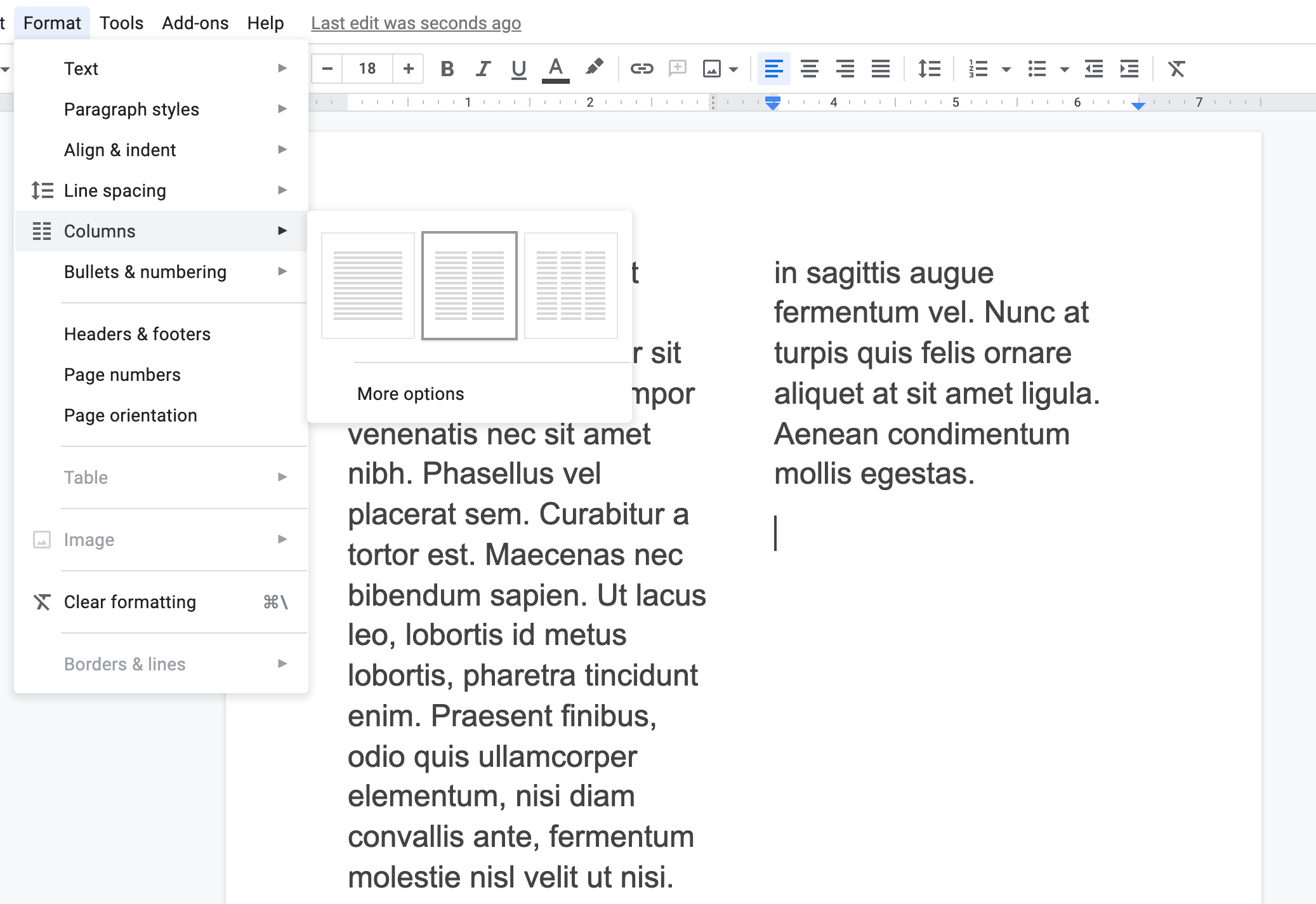
I need to find a special “column” option in the menu of a word processing app...and I have a limited ability to adjust the height and width of the columns. Text boxes clearly offer a designer more freedom, even in the most basic apps.
Even though Sketch is an app for designers, its text boxes offer no more control than text boxes elsewhere. The following example demonstrates how I can change typeface, weight, and size for the highlighted word, but adjusting the line height for the selection adjusts the line height of the entire text box instead.
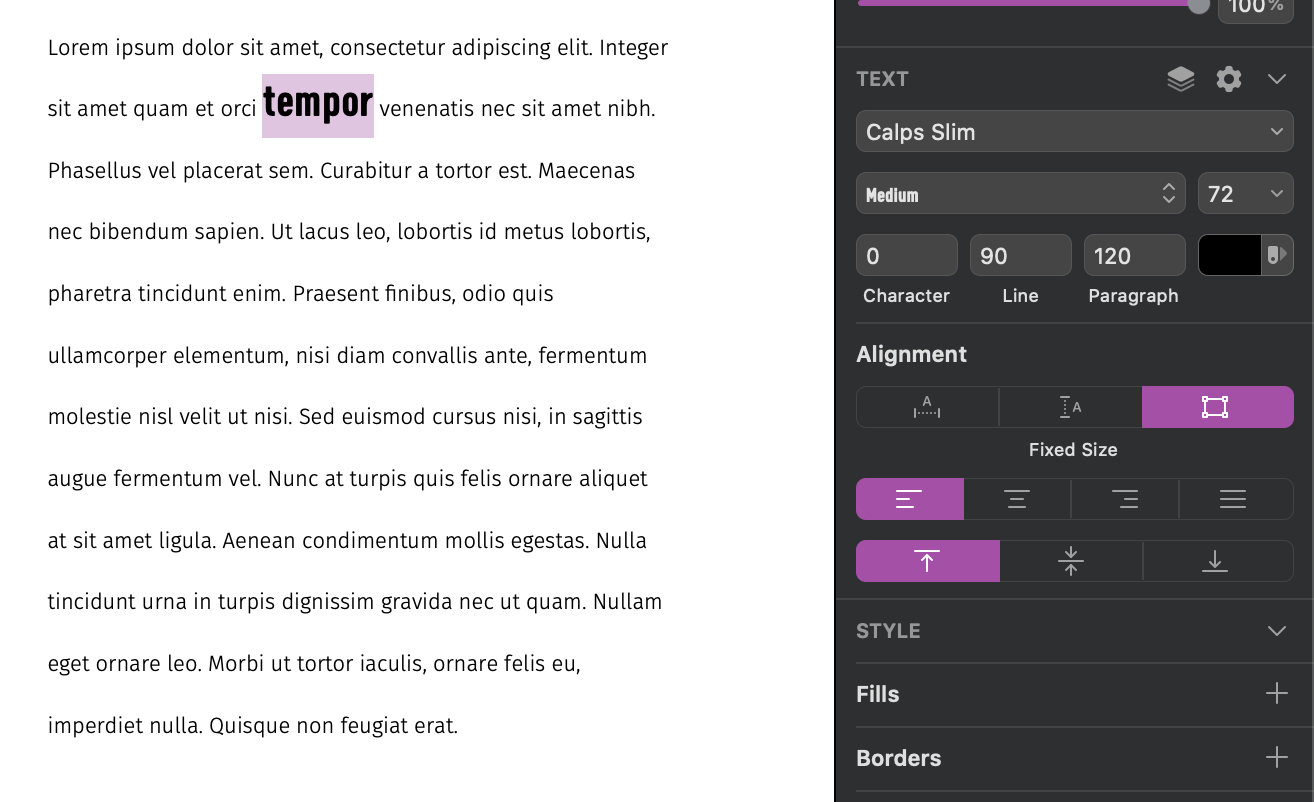
Perhaps this behavior really is the best possible option, as it mimics the web, but greater typographic control is afforded in InDesign.
This thorough examination of text boxes in other applications is a prelude to how profoundly different text is manipulated in InDesign. InDesign also has text boxes, but calls them "frames" instead. This may appear to be a different name for a familiar tool, but make no mistake—frames are very different from text boxes. In fact, all content in an InDesign document exists within frames, including text, images, vectors, and more. The best example to illustrate how frames differ from text boxes is to dissect how images work in InDesign.
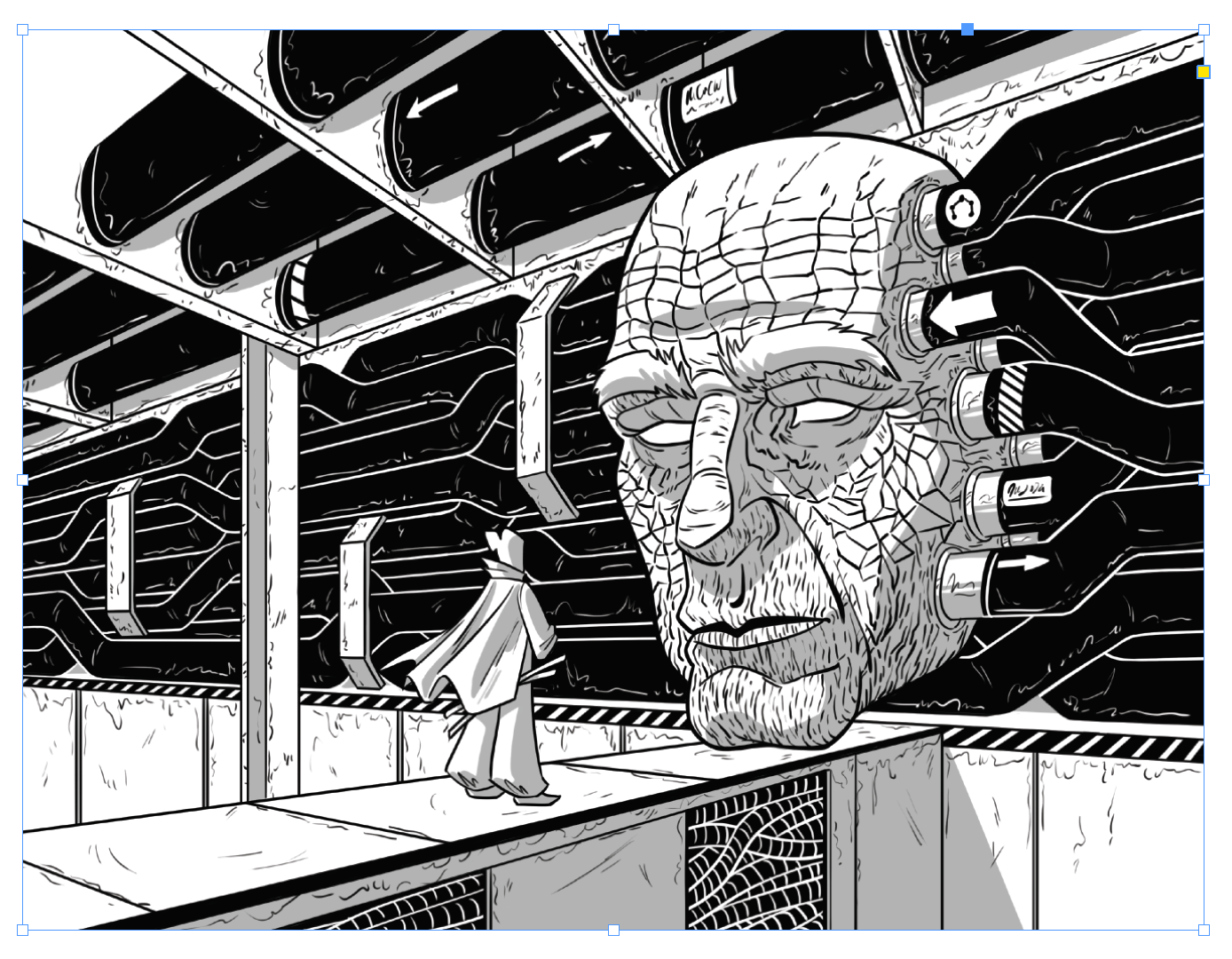
In just about every other graphics program, dragging the corners of an image resizes it. Not so in InDesign! Dragging the corner of an image will crop it instead.
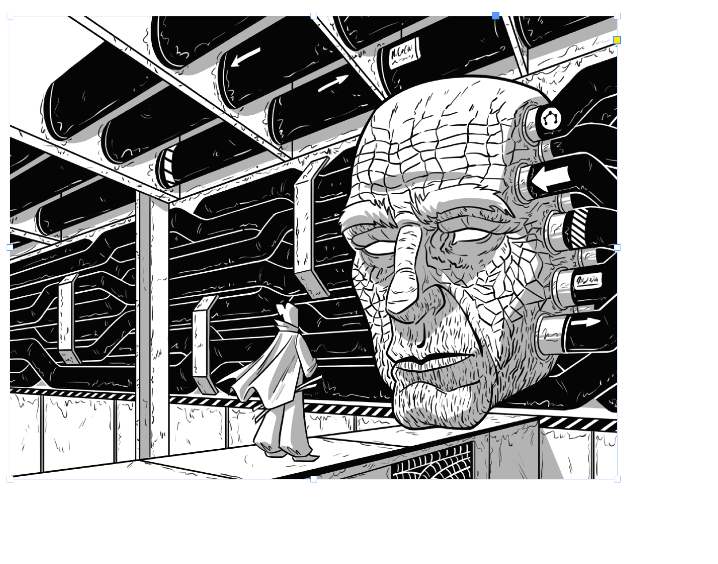
Hold command when dragging a corner to resize the image as expected.
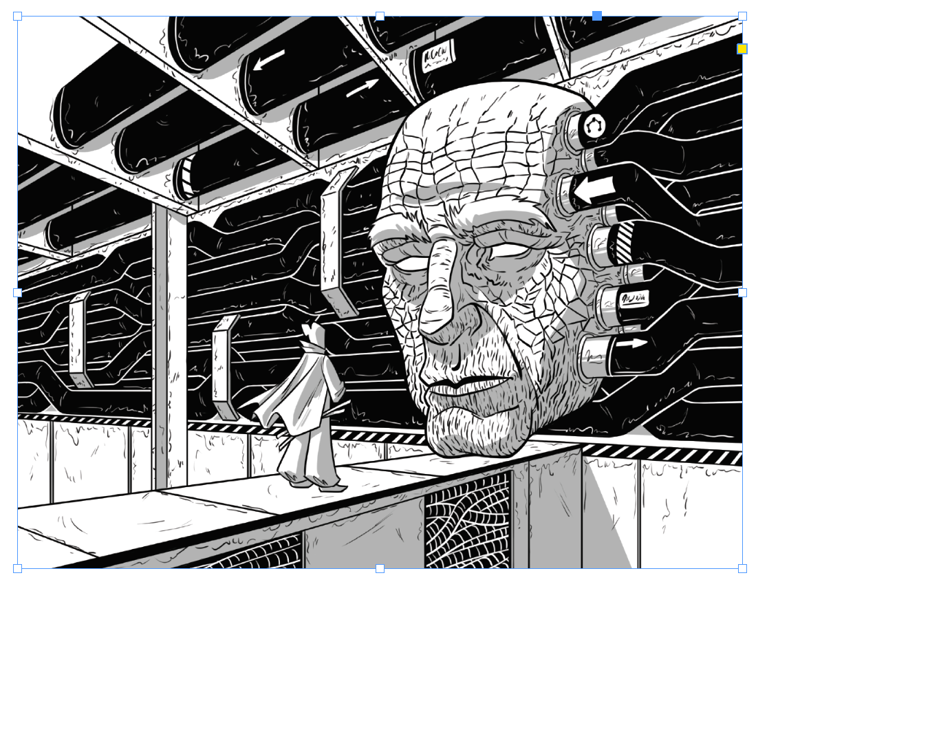
The explanation for this is, a frame is separate from the content it holds. In Google Slides, you are resizing an image, but in InDesign, you are resizing its container. This isn’t an abstract concept—in InDesign, you can place empty frames and later fill them with content.
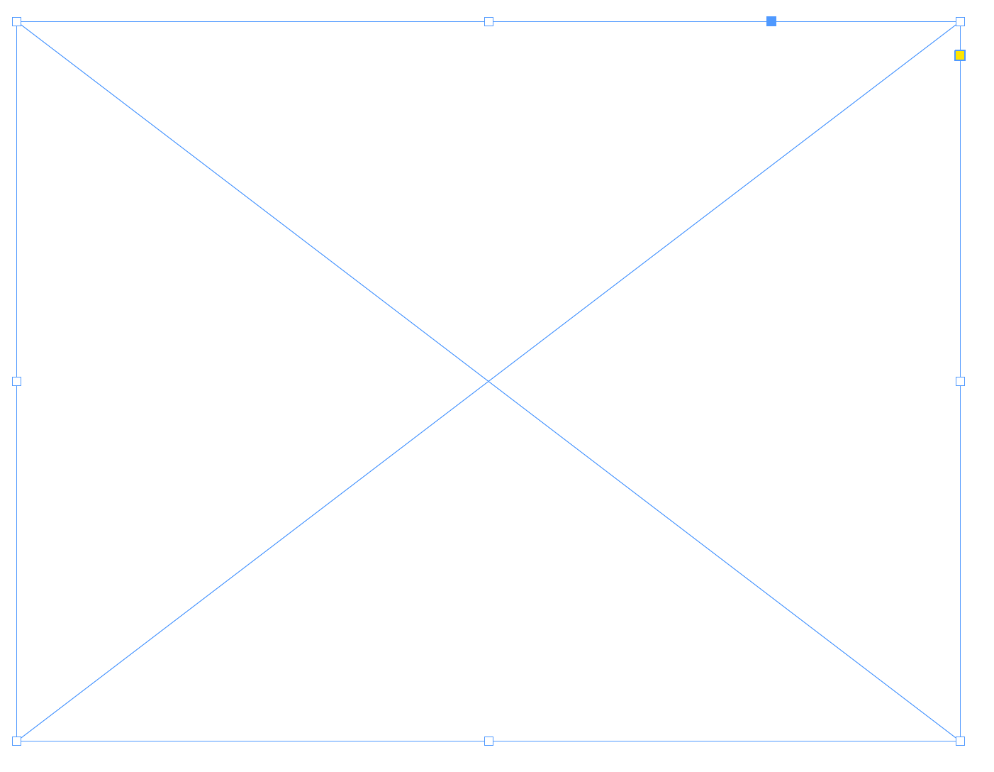
Notice how this frame shares the same blue border as the image above, but contains an X to show that it’s empty.
This distinction between container and content is identical to HTML & CSS, where a resizing a <div> will resize an <img> inside of it.
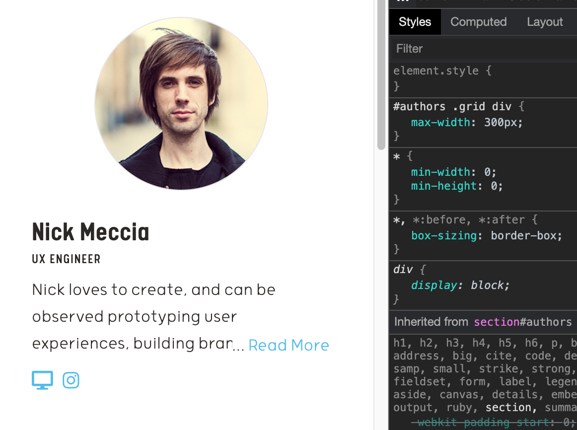
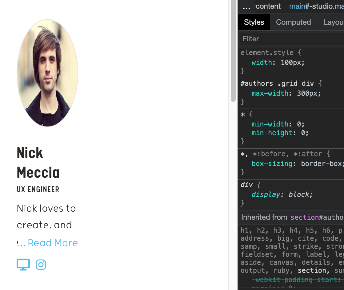
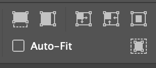
Also similar to CSS, InDesign offers a palette of fill options, which change how images are fit into frames. This behavior mirrors the background-size property in CSS.
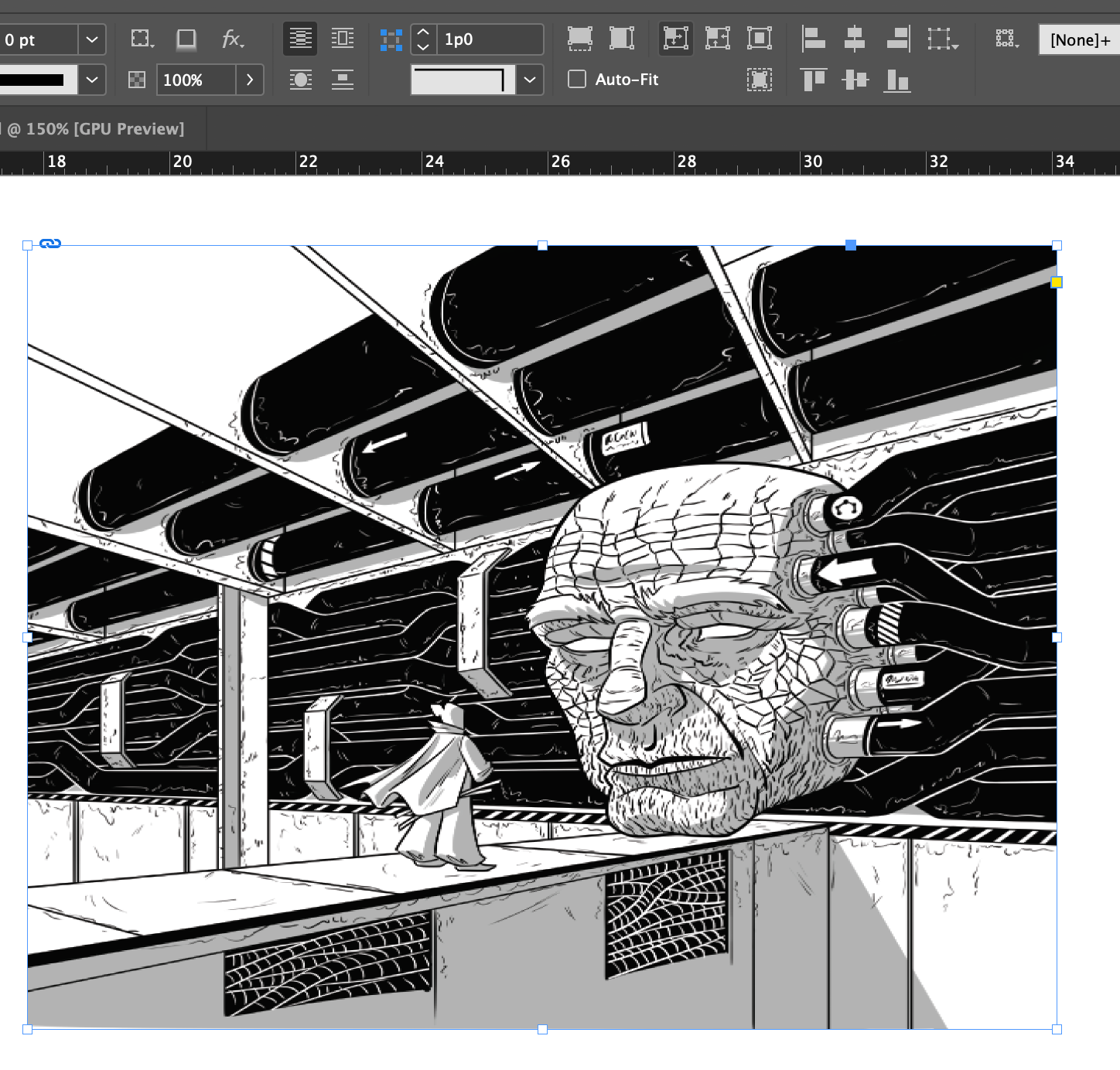
When you hover over an image in InDesign, a circular handle appears. Drag this handle to reposition an image in its frame, cropping it at the edges. This is a similar function to background-position in CSS.
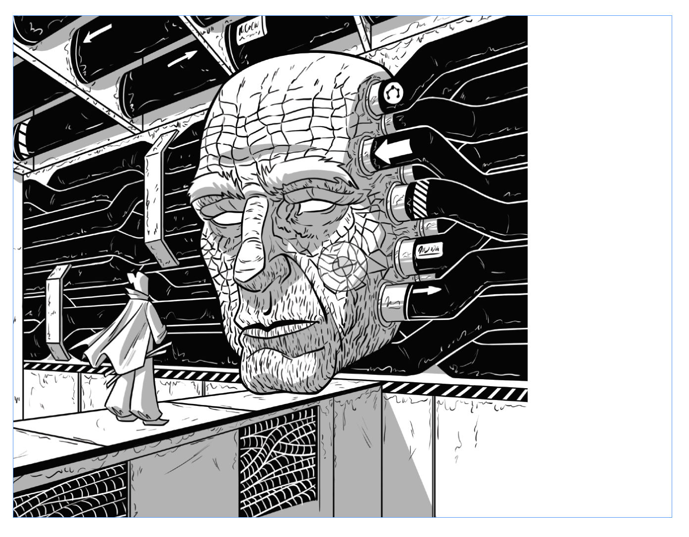
Many of the ways InDesign uses frames to manipulate images recall ways in which CSS manipulates content. Are there more ways we can learn from CSS to manipulate frames like divs?
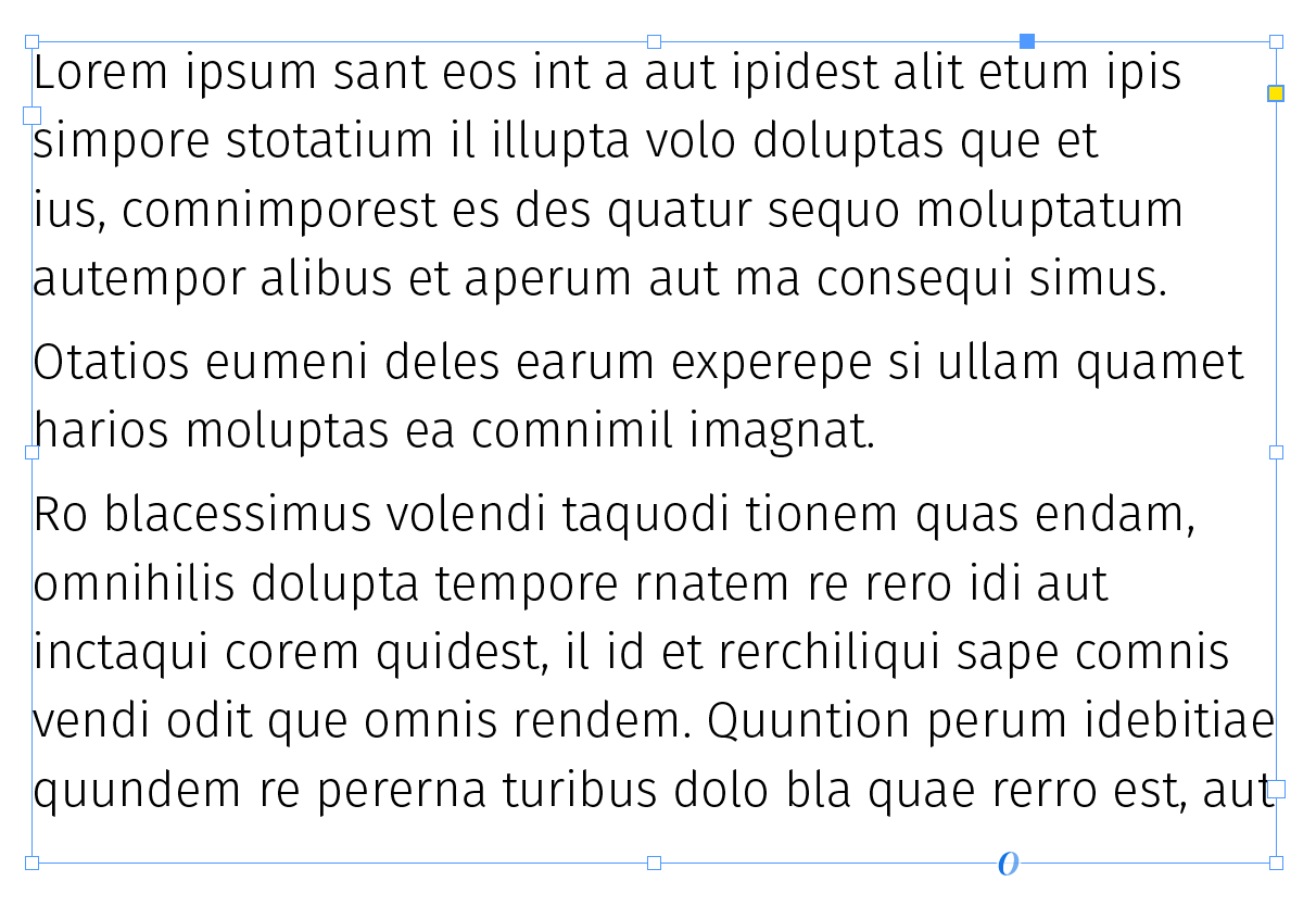
The significance of using images to demonstrate frames was an introduction to this point: frames can accept any content. For example, I can fill a frame with text...
...and paste an image inside of it.
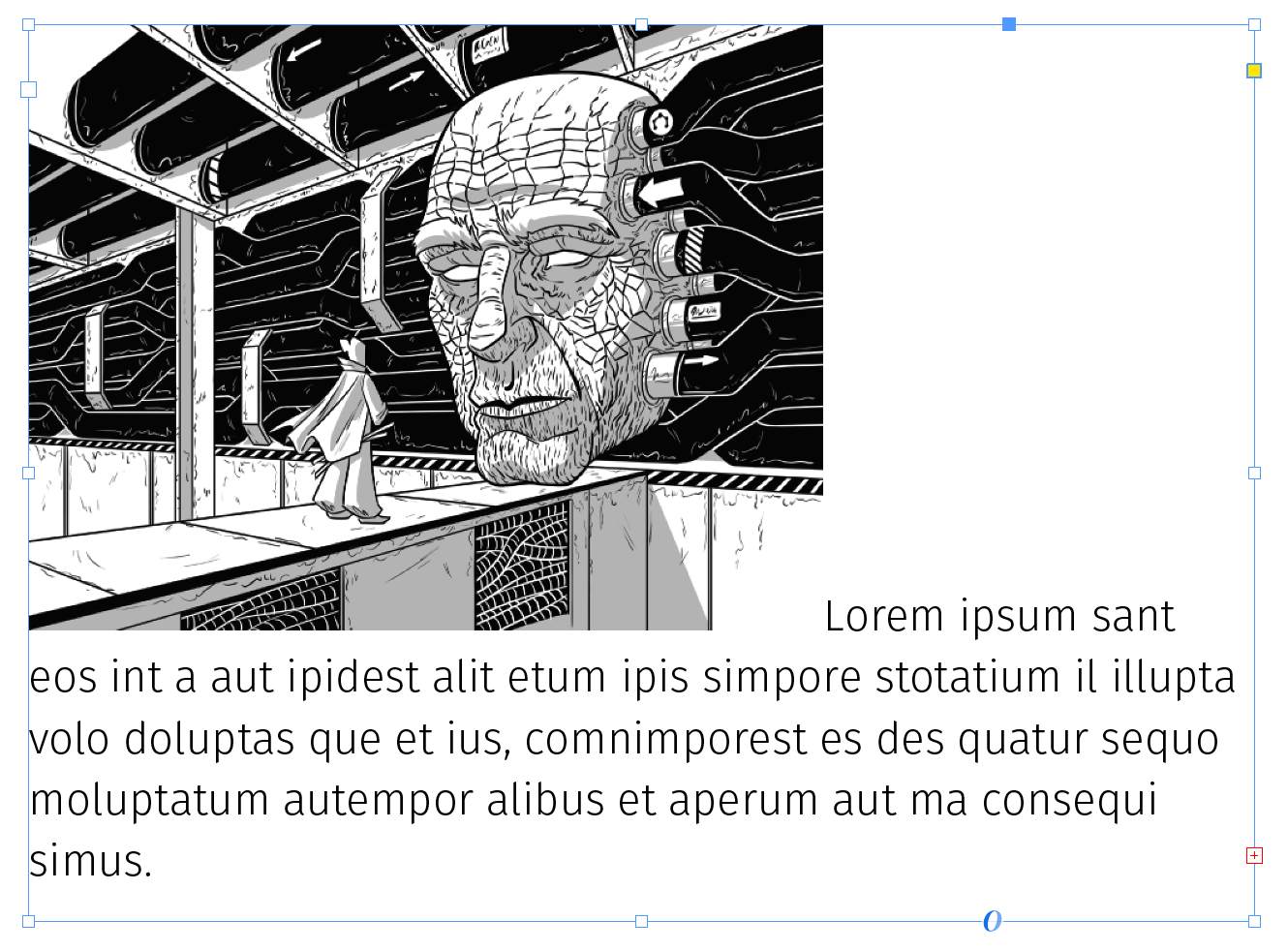
This behavior may seem no different from a Microsoft Word document, which has accommodated inline images since the beginning of time, but it is significant to note that you do not need to manually adjust image placement each time the content changes. This was my life before learning about frames:
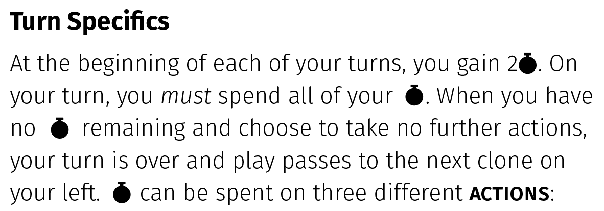
Whenever I revised the text, my icons were suddenly out of alignment!
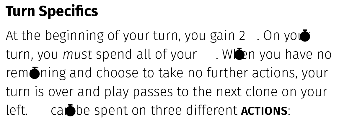
I would manually move each icon back into place...
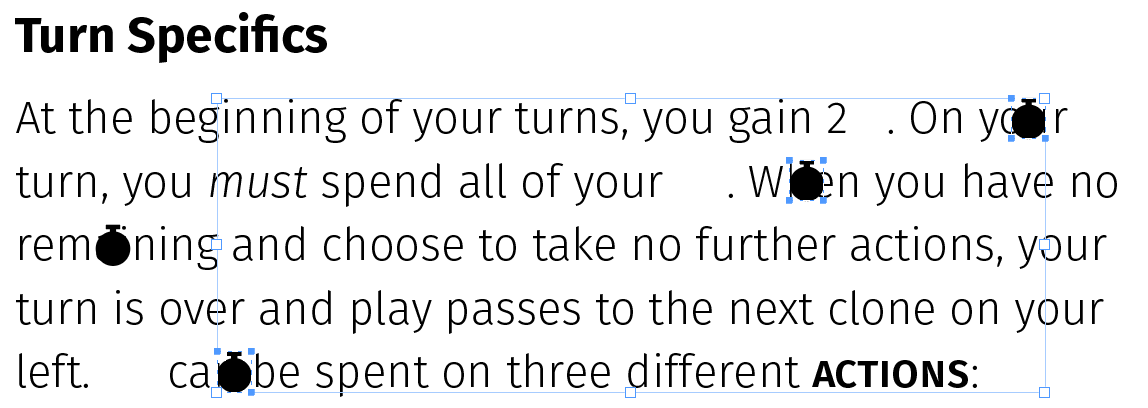
...but the InDesign didn’t account for the icons when calculating line breaks. The icon on the right breaks out of the text frame! Ugh!!
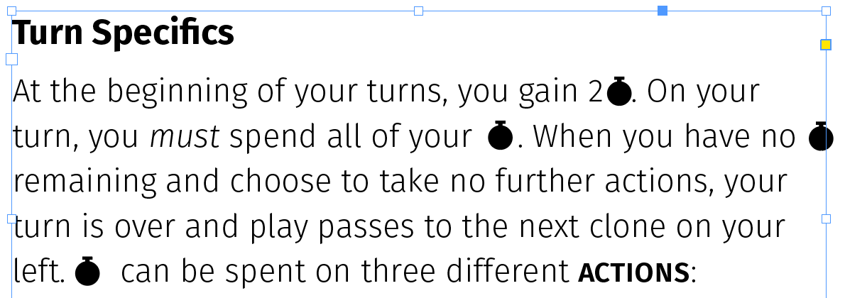
After endless frustrating hours of moving tiny icons with every copy change I made, I eventually had a breakthrough inspiration: what if I placed all of these tiny icons into the frame, like I would on the web with a <span>? Ever since, my editing and rewriting process has become so much smoother.
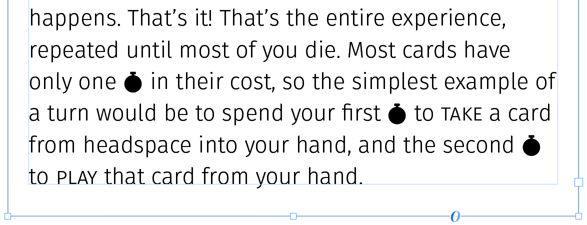
I made the following change in seconds:
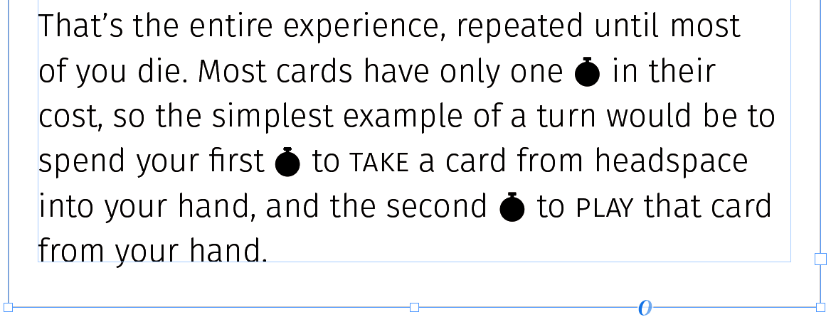
Again, this may hardly seem revelatory, but taken altogether, a frame is almost exactly the same as a <div>. Page breaks in InDesign prime you to treat each page as a static, unchanging object, but a single frame linked across your entire document is more versatile than prior experience in Microsoft Office has conditioned us to believe.
In the rulebook for my card game, I put absolutely all content within the same frame. Every example image, icon...even other text frames!
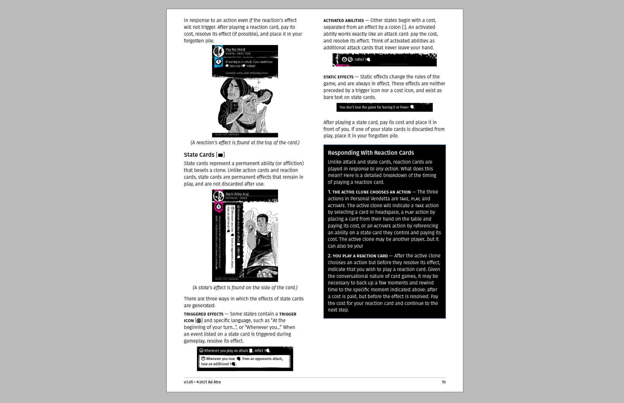
Look at how my entire layout adjusts when I add new content! Amazing!
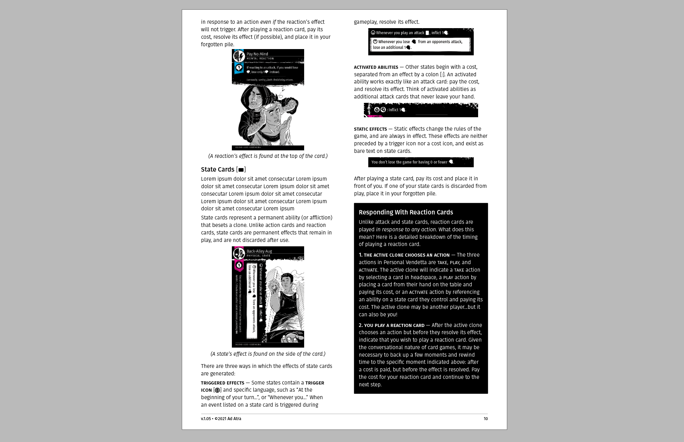
Frames are far more powerful than text boxes. Text boxes just hold text! When you view a frame as a <div>, or as a container for any content, many possibilities arise for saving you time and streamlining your workflow.