Communication is hard. It's hard to find the words to express your intent, and even harder to first articulate that intent in your mind. Communication is also hard because you must consider your audience when crafting your message, or risk a misunderstanding. Harder still is written communication, which requires very precise language, as you will not have the luxury of clarifying your intent through conversation with the reader.
Hardest of all is visual communication, as it relies on a language we are less practiced with. However, despite this great difficulty, visual communication carries great power: it can transmit your message more clearly and immediately than words, especially for audiences who would rather not read (hint: this is most audiences).
Design is the discipline of visual communication, and it contains tools for clarifying visual messages. The most effective of these tools is called hierarchy, and it describes the relationships between each element in a design. Addressing these relationships is the the quickest path to improving your design and clarifying your message. This article is the first in a series on hierarchy, and will guide you through a simple set of steps to apply visual hierarchy to your designs: first determine the importance of each element in your message, change one relationship in your design, then re-evaluate all relationships.
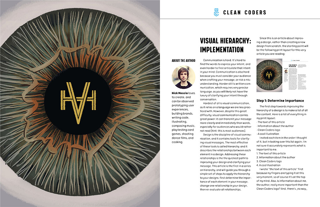
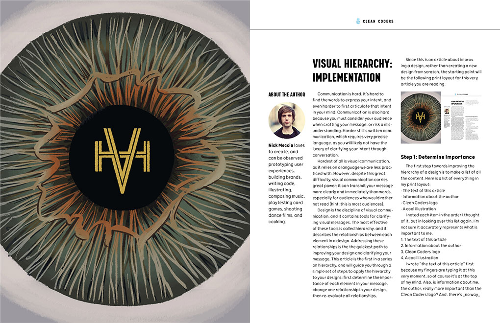
Since this is an article about improving a design, rather than creating a new design from scratch, the starting point will be the following print layout for this very article you are reading:
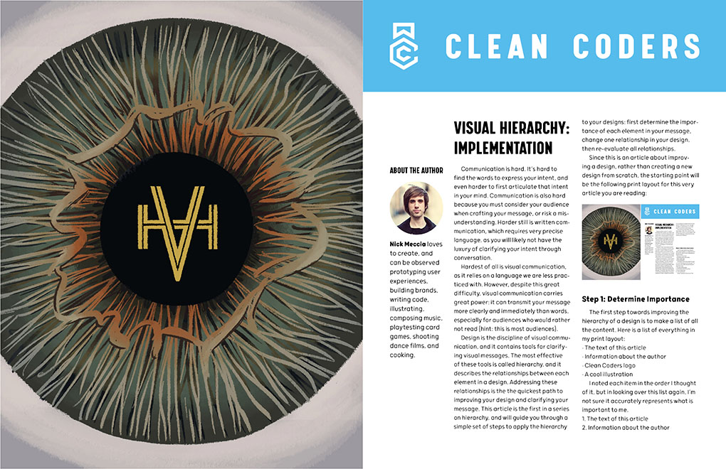
How can we improve this design with visual hierarchy? Keep reading to find out!
Step 1: Determine Importance
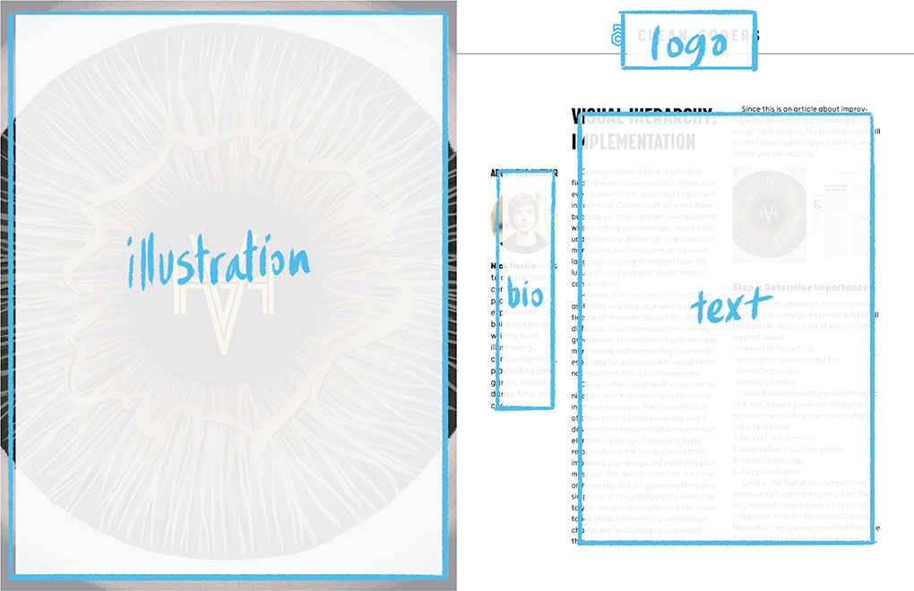
The first step towards improving the hierarchy of a design is to make a list of all the content. Here is a list of all the content included in my print layout:
- The text of this article
- Information about the author
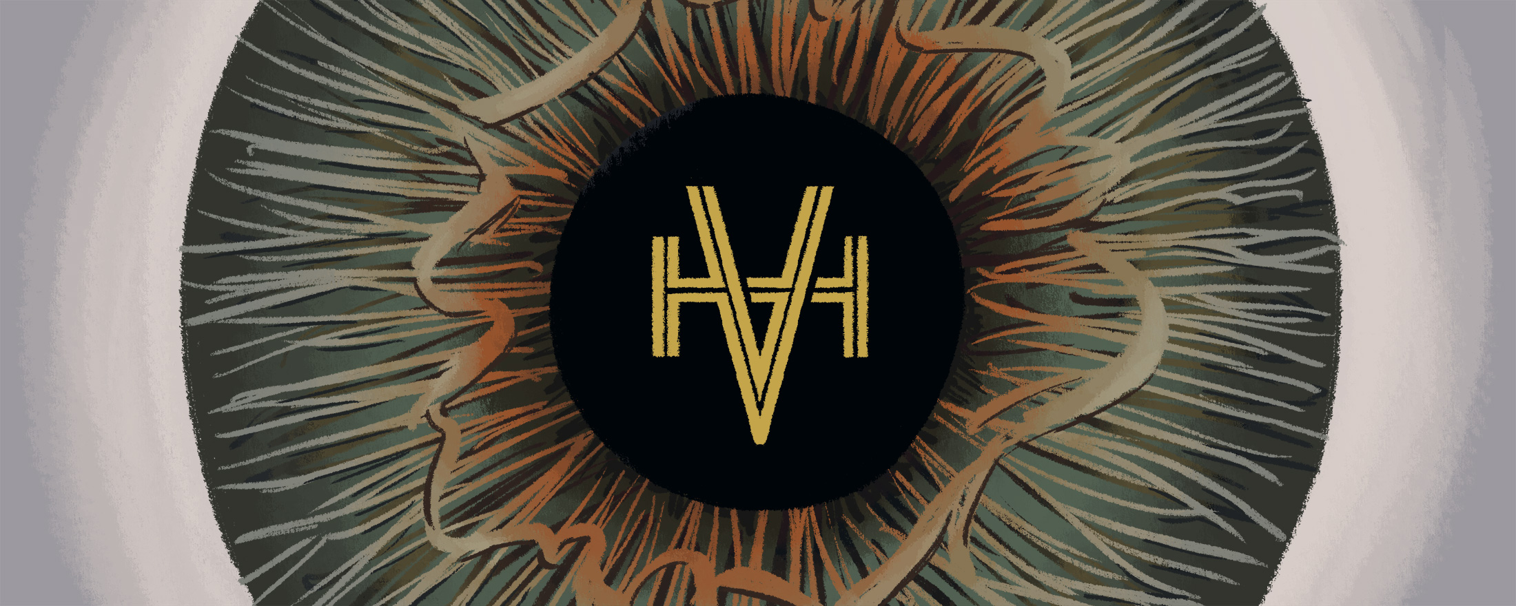
- Clean Coders logo
- A cool illustration
I noted each item in the order I thought of it, but if I assign a numerical value to each item in my list, I'm not sure it accurately represents what is important to me.
- The text of this article (most important)
- Information about the author
- Clean Coders logo
- A cool illustration (least important)
I wrote "the text of this article" first because my fingers are typing it at this very moment, so of course it's at the top of my mind. Also, is information about me, the author, really more important than the Clean Coders logo? And, there's no way a cool illustration should be last - that just sounds like a waste! This list should reflect the imporance of each element in the message I wish to send to the viewer. Here is a revised list, ordered in accordance with my priorities:
- A cool illustration (most important)
- The text of this article
- Clean Coders logo
- Information about the author (least important)
I decided that "a cool illustration" is the most important element of my design - I envision it as the hook that reels in a passive viewer's eye, and interests them in my article. Next, I decided that the article's text is important - this is the core of my message, and this exercise would be pointless if no one read my work. The Clean Coders logo is somewhat important, as it reminds the reader where this content is from, but it is not nearly as important as the previous items on the list, so I decided to place it third. Finally, I decided that information about me, the author, is least important, but is still a useful inclusion, and thus listed it last.
Step 2: Change One Relationship
Now that I am clear on my priorities, I can assess how clear my design is.
There's a lot going on here; if I reduce my design to a set of shapes, it should be even easier to interpret.

Visual hierarchy can be influenced by many qualities - size, position, value, and color - but for this example will only manipulate size, as the goal of this article is merely to outline the process for making changes.
The size of each shape in my simplified design represents each element's importance - the larger a shape, the more it stands out.
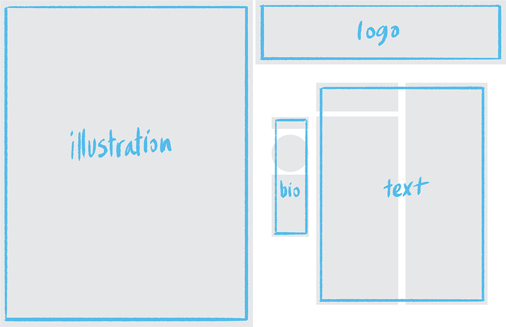
Comparing this against my list, it appears I have a problem:
- A cool illustration
- The text of this article
- Clean Coders logo
- Information about the author
The Clean Coders logo is too huge! It reads as the title of my article, when it's just branding. According to my list, the article's text should be more important, so let's change the relationship between the logo and the article text.
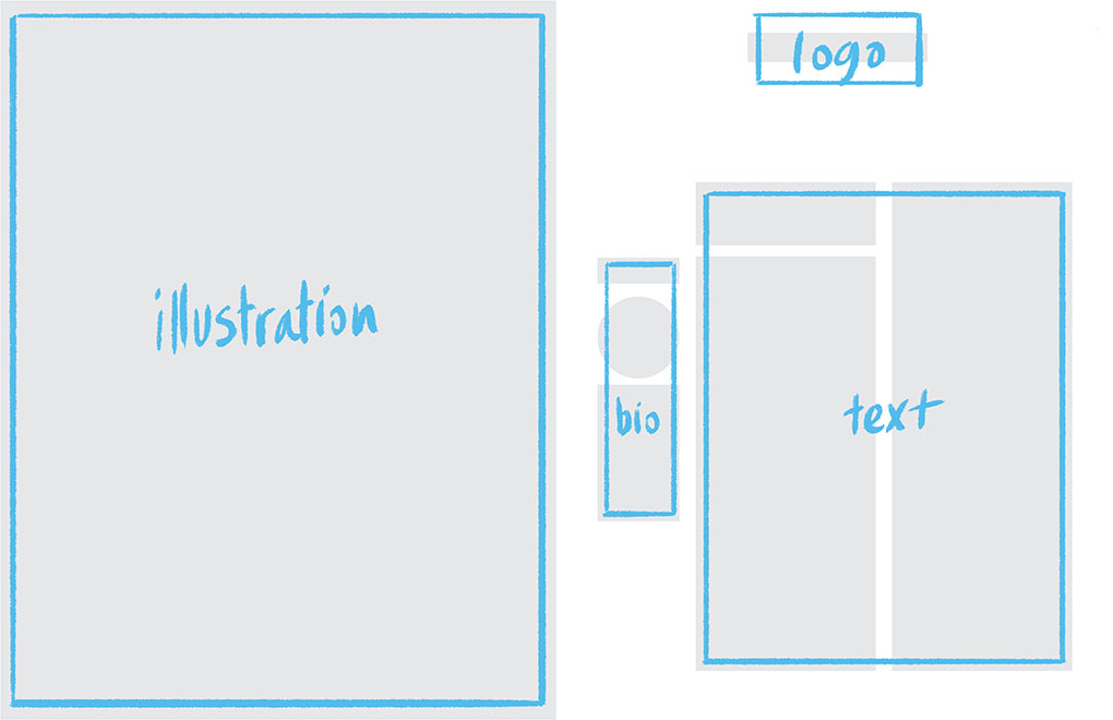
Much better! But, is it enough?
Visual hierarchy is the web which connects all elements of a design, and making even one change can affect all other components. Before making any further changes, I need to evaluate how effective it was to change one size.
Step 3: Re-evaluate Relationships
Here is the full design with a smaller logo treatment:
It certainly appears that this revision follows my list of importance...
I can confirm - the sizes of the shapes now correspond to the order of my priorities! Nice.
During this step, it is important to evaluate all relationships. For example, what if I made the logo the same width as the sidebar?
This is an overcorrection - now the logo is the least important item on the page!
Making changes to hierarchy can infringe on seemingly unrelated parts of the design, which is why it's important to only change one relationship at a time. If after making one change there is still a mismatch between the message intended and the message created, return to the first step and change one more thing.
How do I know what to change?
This article serves as the introduction to a series on hierarchy, and lays the foundation for detailed discussion on more specific strategies without the need to endlessly rehash the basics. In subsequent articles I will discuss in detail how to manipulate size, position, value, and color to more clearly and effectively communicate your priorities, following the simple procedure outlined here. Regardless of your design or the changes you attempt, follow these three steps until your design speaks to your audience as clearly as if they could read your mind!