Harry turned the card back over and saw, to his astonishment, that Dumbledore’s face had disappeared.
“He’s gone!”
“Well, you can’t expect him to hang around all day,” said Ron. “He’ll be back. No, I’ve got Morgana again and I’ve got about six of her . . . do you want it? You can start collecting.”
Ron’s eyes strayed to the pile of Chocolate Frogs waiting to be unwrapped.
“Help yourself,” said Harry. “But in, you know, the Muggle world, people just stay put in photos.”
“Do they? What, they don’t move at all?” Ron sounded amazed. “Weird!”
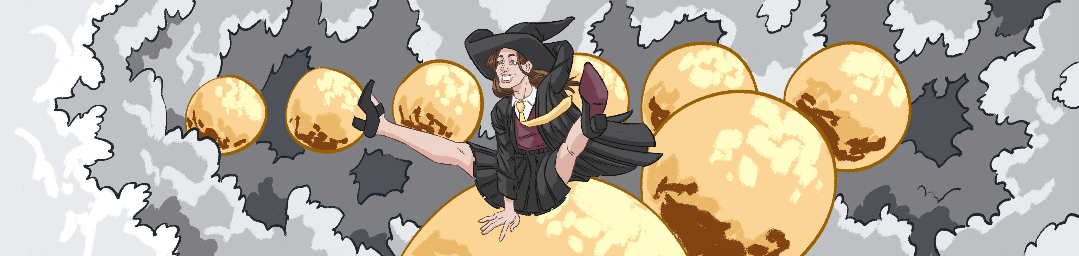
— from “Harry Potter and the Sorcerer’s Stone” by J.K.Rowling
Animation is a great way to make a dynamic, engaging website and provides users with a delightful and fun experience. With animation, you can increase visual hierarchy, provide visual feedback to a user action, show relationships, and confirm transitions between elements. There are several ways to make an animation for a website. In this post, I will show how to make an animation with CSS.
Transform
Before we start to explore the magic world of CSS animation, I would like to remind you about the transform property. This is an essential building block of our knowledge citadel.
The transform CSS properties make it possible to translate, rotate, scale, and skew any HTML element.
The translate function moves an element up, down, right, and left.
<style>
 .parent {
   background-color: gray;
   height: 400px;
   width: 400px;
 }

 .child {
   background-color: gold;
   height: 50%;
   width: 50%;
   border-radius: 50%;
}

 .parent:hover .child {
   transform: translateX(100%) translateY(100%);
 }
 </style>
The rotate function rotates an element clockwise or anticlockwise. You can specify the rotation value in degrees, turns, or radians. The other elements on a page will not be affected by this transformation.
 <style>
  .parent {
    background-color: gray;
    height: 400px;
    width: 400px;
    padding-top: 150px;
    padding-left: 150px;
   }

  .child {
    background-color: gold;
    height:200px;
    width: 200px;
    }

  .parent:hover .child {
    transform: rotate(45deg);
   }
  </style>
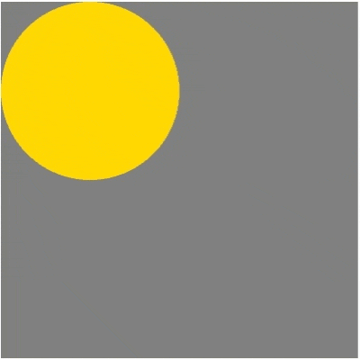
The scale function changes the size of an element. The scale() method affects both the X and Y axes. Scale(X) increases or decreases the width of an element. Scale(Y) increases or decreases the height of an element. By default, the scale function starts at the center. You can set the origin of transformation by adding value to transform-origin.
<style>
 .parent { background-color: gray;
   height: 400px;
   width: 400px;
   padding-top: 100px;
   padding-left: 100px }

 .child {
   background-color: gold;
   height: 50%;
   width: 50%;
  border-radius: 50%;
 }

 .parent:hover .child {
   transform: scale(1.5);
 }
</style>
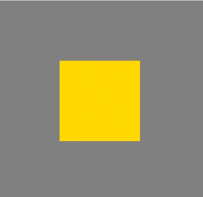
The skew function tilts an element in the X or Y direction. The angle can be set in one of several units.
 <style>
  .parent {
    background-color: gray;
    height: 400px;
    width: 400px;
    padding-top: 100px;
    padding-left: 100px;
  }

 .child {
   background-color: gold;
   height: 50%;
   width: 50%;
   border-radius: 50%;
  }

 .parent:hover .child {
   transform: skew(15deg, 15deg);
  }
 </style>
Animation with Transition
You can create a simple animation with transition properties. A transition is a movement from one CSS style to another. Usually, this type of animation works on some trigger, like a hover state or a specific class. A transition should be applied to a base element, not to an element where the transition occurs.
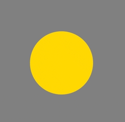
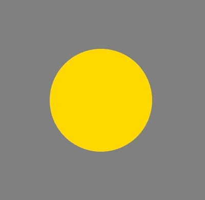
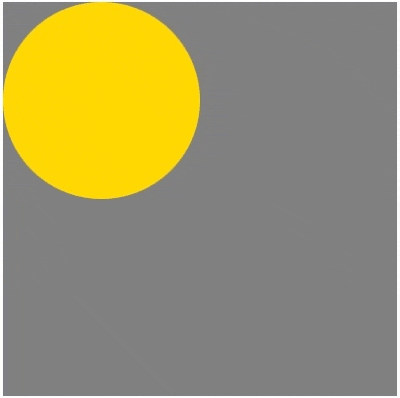
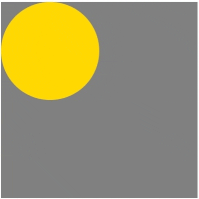
Let’s look at an example which shows golden ball on a gray background.
<style>
  .parent {
    background-color: gray;
    height: 400px;
    width: 400px;
   }

  .child {
    background-color: gold;
    height: 50%;
    width: 50%;
    border-radius: 50%;
   }
</style>
<body>
<div class="parent">
  <div class="child"></div>
</div>
</body>

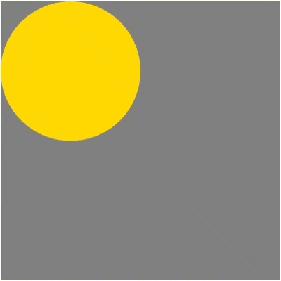
Now I want the golden ball to move from left to right. For this purpose, I will add transform properties
<style>
  .parent {
    background-color: gray;
    height: 400px;
    width: 400px;
   }

  .child {
    background-color: gold;
    height: 50%;
    width: 50%;
    border-radius: 50%;
   }

  .parent:hover .child {
    transform: translateX(100%)
   }
</style>
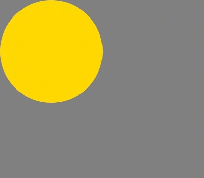
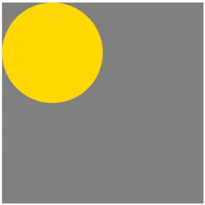
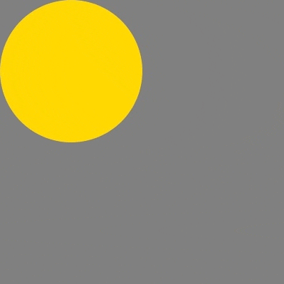
This animation does not look natural or realistic at all. The ball is jumping from one side to the other. To make it move smoothly from left to right, let’s add some properties.
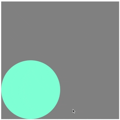
First, let’s specify the length of the transition by adding transition-duration properties. transition-duration shows the time an animation should take to complete. The duration can be in seconds or milliseconds. If the time is not determined, a transition will not work because the default status is 0s.
<style>
  .parent {
    background-color: gray;
    height: 400px;
    width: 400px;
   }

  .child {
    background-color: gold;
    height: 50%;
    width: 50%;
    border-radius: 50%;
    transition-duration: 1s;
   }

  .parent:hover .child {
    transform: translateX(100%);
    background-color: aquamarine;
   }
</style>
By default, a transition is applied to all properties. You can specify which properties will be affected by adding transition-properties. They can be one or several things.
<style>
  .parent {
    background-color: gray;
    height: 400px;
    width: 400px;
   }

  .child {
    background-color: gold;
    height: 50%;
    width: 50%;
    border-radius: 50%;
    transition-duration: 1s;
    transition-property: transform;
   }

  .parent:hover .child {
    transform: translateX(100%);
    background-color: aquamarine;
   }
</style>
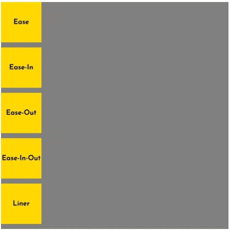
Next, I would like to specify a timing function. transition-timing-function defines the phase of the transition effect. There are several built-in easing functions: ease (default), liner, ease-in, ease-out, and ease-in-out.
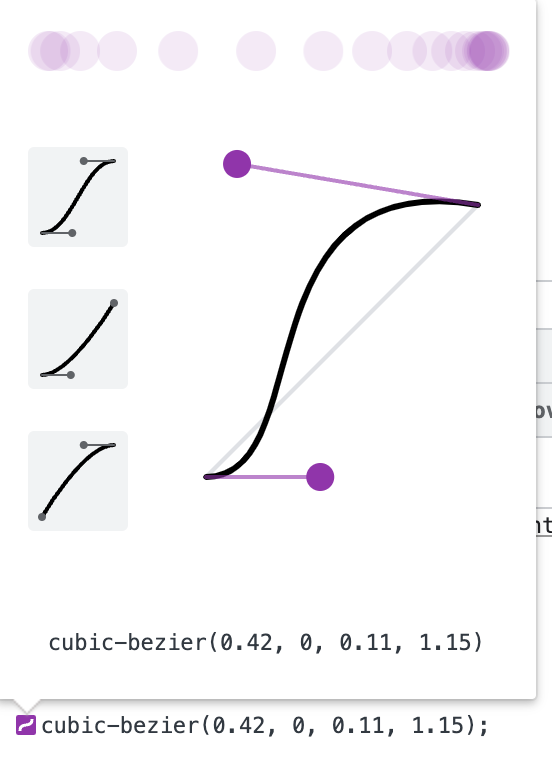
You also can customize a timing function with the cubic-bezier function. It is based on four points: the first (0;0) and the last (1;1) are constants, but you need to define two more. To complete this task, you can use online tools like https://www.cssportal.com/css-cubic-bezier-generator/, https://easings.co/, https://10015.io/tools/css-cubic-bezier-generator.
For the second method, open a browser and inspect the element. Find the line with transition-timing-function and click on the icon with a curve.
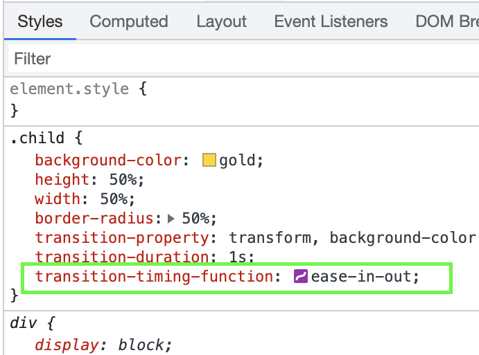
Make adjustments, copy the function, and paste into the CSS.
<style>
  .parent {
    background-color: gray;
    height: 400px;
    width: 400px;
   }

  .child {
    background-color: gold;
    height: 50%;
    width: 50%;
    border-radius: 50%;
    transition-property: transform, background-color;
    transition-duration: 1s;
    transition-timing-function: ease-in-out;
   }

  .parent:hover .child {
    transform: translateX(100%);
    background-color: aquamarine;
   }
</style>

Last but not least is transition-delay. transition-delay specifies when the transition will start. For this property, a negative value is available: an animation will look like it is already playing for an established time. Let’s add transition-delay of 200ms. After a mouse hover over the parent element, a transition will start with a 200ms delay.
<style>
  .parent {
    background-color: gray;
    height: 400px;
    width: 400px;
   }

  .child {
    background-color: gold;
    height: 50%;
    width: 50%;
    border-radius: 50%;
    transition-property: transform, background-color;
    transition-duration: 1000ms;
    transition-timing-function: ease-in-out;
    transition-delay: 200ms;
   }

  .parent:hover .child {
    transform: translateX(100%);
    background-color: aquamarine;
   }
</style>

For clean CSS, you can shorten these properties to one line. The order of functions is not essential except for duration and delay. The browser reads the first value as transition-duration and the second as transition-delay.
<style>
  .parent {
    background-color: gray;
    height: 400px;
    width: 400px;
 }

  .child {
    background-color: gold;
    height: 50%;
    width: 50%;
    border-radius: 50%;
    transition: transform, background-color, 1000ms ease-in-out 200ms;
   }

  .parent:hover .child {
    transform: translateX(100%);
    background-color: aquamarine;
   }
</style>

Animation with Keyframes
For more complex animations, CSS has the @keyframe] at-rule.
Keyframes make it possible to create complex and flexible animations. The keyframes contain all information about how an animation will look from start to finish.
First, let’s specify properties for an animation. Animation properties should be in a place where you want them to happen. In this example, I want the golden ball (child) to move when I hover over the grey background (parent). I will set animation-name and animation-duration to .parent:hover .child.
<style>
  .parent {
    background-color: gray;
    height: 400px;
    width: 400px;
   }

  .child {
    background-color: gold;
    height: 50%;
    width: 50%;
    border-radius: 50%;
   }

   .parent:hover .child {
     animation-name: the-best-animation;
     animation-duration: 2s;
    }
</style>
To define the appearance of this animation, let’s establish the @keyframe at-rule. This @keyframe at-rule should be outside of any selectors. Don’t forget to specify a name for the animation.
There are two ways to define animation sequences: the first is to use a from… to declaration, and the second is to use percentage in time.
<style>
  .parent {
    background-color: gray;
    height: 400px;
    width: 400px;
   }

  .child {
    background-color: gold;
    height: 50%;
    width: 50%;
    border-radius: 50%;
   }

  .parent:hover .child {
    animation-name: the-best-animation;
    animation-duration: 2s;
  }

  @keyframes the-best-animation {
  100% {
     transform: translateX(100%);
     background-color: aquamarine;
    }
  }
</style>
At the end of the animation, the circle resets to its initial state. With animation-fill-mode it is possible to change this behavior. animation-fill-mode specifies styles for elements before an animation starts and after it ends. The available values are none, forwards, backwards, both, initial, and inherit.
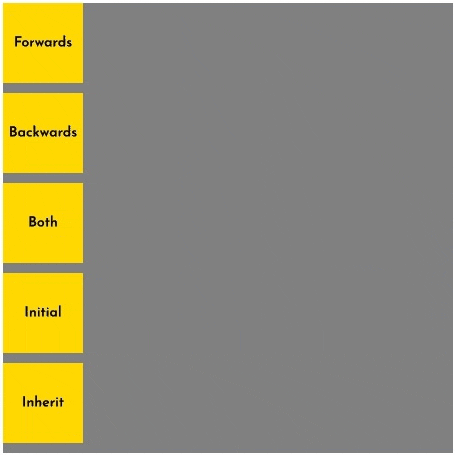
Now I want the golden ball to stay in a final position after an animation is finished. Let’s apply the value forwards to animation-fill-mode.
<style>
  .parent {
    background-color: gray;
    height: 400px;
    width: 400px;
   }

  .child {
    background-color: gold;
    height: 50%;
    width: 50%;
    border-radius: 50%;
   }

  .parent:hover .child {
    animation-name: the-best-animation;
    animation-duration: 2s;
    animation-fill-mode: forwards;
   }

  @keyframes the-best-animation {
    100% {
      transform: translateX(100%);
      background-color: aquamarine;
    }
  }
</style>
To extend this animation and make the golden ball’s behavior more complex, I want to add more steps to the @keyframe at-rule. Now the ball changes position, color, and size.
<style>
  .parent {
    background-color: gray;
    height: 400px;
    width: 400px;
   }

  .child {
    background-color: gold;
    height: 50%;
    width: 50%;
    border-radius: 50%;
   }

  .parent:hover .child {
    animation-name: the-best-animation;
    animation-duration: 2s;
    animation-fill-mode: forwards;
   }

  @keyframes the-best-animation {
   0% {
     transform: translateX(0);
     background-color: aquamarine;
    }

  35% {
     transform: translateX(100%) scale(0.5);
     background-color: pink;
    }

  65% {
     transform: translateX(100%) translateY(100%) scale(0.5);
     background-color: violet;
    }

  100% {
  transform: translateY(100%);
  background-color: aquamarine;
    }
  }
</style>

You can also specify how many times an animation will repeat by adding values to animation-iteration-count. The value can be set by number or by global values. For endless animation, use infinite keyword as a value.
<style>
  .parent {
    background-color: gray;
    height: 400px;
    width: 400px;
  }

  .child {
    background-color: gold;
    height: 50%;
    width: 50%;
    border-radius: 50%;
  }

  .parent:hover .child {
    animation-name: the-best-animation;
    animation-duration: 2s;
    animation-fill-mode: forwards;
    animation-iteration-count: 2;
  }

  @keyframes the-best-animation {
  0% {
    transform: translateX(0);
    background-color: aquamarine;
    }

  35% {
    transform: translateX(100%) scale(0.5);
    background-color: pink;
    }

  65% {
     transform: translateX(100%) translateY(100%) scale(0.5);
     background-color: violet;
    }

  100% {
     transform: translateY(100%);
     background-color: aquamarine;
    }
  }
</style>
With animation-direction it is possible to specify how an animation should be played: forward, backward, reverse, alternate, or alternate-reverse. The delay property is also available for animations. These properties also work with CSS transitions.
<style>
  .parent {
    background-color: gray;
    height: 400px;
    width: 400px;
  }

  .child {
    background-color: gold;
    height: 50%;
    width: 50%;
    border-radius: 50%;
  }

  .parent:hover .child {
    animation-name: the-best-animation;
    animation-duration: 2s;
    animation-fill-mode: forwards;
    animation-iteration-count: 2;
    animation-direction: alternate-reverse;
  }

  @keyframes the-best-animation {
  0% {
    transform: translateX(0);
    background-color: aquamarine;
    }

  35% {
    transform: translateX(100%) scale(0.5);
    background-color: pink;
    }

  65% {
    transform: translateX(100%) translateY(100%) scale(0.5);
    background-color: violet;
    }

  100% {
    transform: translateY(100%);
    background-color: aquamarine;
    }
  }
</style>

Now I want to make the animation work endlessly. I will shorten properties by writing them in one line. The order of functions is not essential except for duration and delay. The browser reads the first value as animation-duration and the second as animation-delay. Then I will replace animation properties for the child element. These manipulations will make the animation play forever without any trigger.
<style>
  .parent {
    background-color: gray;
    height: 400px;
    width: 400px;
  }

  .child {
    background-color: gold;
    height: 50%;
    width: 50%;
    border-radius: 50%;
    animation: the-best-animation 2s forwards infinite alternate-reverse;
  }

  @keyframes the-best-animation {
  0% {
    transform: translateX(0);
    background-color: aquamarine;
    }

  35% {
    transform: translateX(100%) scale(0.5);
    background-color: pink;
    }

  65% {
    transform: translateX(100%) translateY(100%) scale(0.5);
    background-color: violet;
   }

  100% {
    transform: translateY(100%);
    background-color: aquamarine;
    }
  }
</style>
Repetitio est mater studiorum
This article provides all the information you need to start creating CSS animations. You can see how easy it is to make magic by manipulating space, color, shape, and time. You can animate text, buttons, dropdown menus, logo, and other elements on a page. One warning: have a clear reason to add animation to your design. One common example is to provide visual feedback on user actions. Remember that the best way to master something is constant practice. Experiment, look for best practices, and become a master of animations.