
In a world where over one billion people are living with disabilities, it's unnerving to realize that the fundamental design of our everyday environments, both physical and digital, is overwhelmingly geared towards people without any physical limitations. Put yourself in the position of a wheelchair user who finds themselves outside of a store that has no ramp in sight. This is not a minor inconvenience, it is a denial of access that turns a simple errand into an obstacle.
For those who are visually impaired, the narrative is similar because there often isn't any Braille or highly contrasted signage present, which makes navigating public spaces close to impossible. Individuals who are hard of hearing encounter their own challenges, particularly in settings where verbal communication is the primary mode of communication. Lack of visual cues or sign language support can cause announcements and important information to be missed in both subway stations and airports. However, the issue is much more widespread than ramps in our daily infrastructure. This inaccessibility is also deeply embedded in our digital spaces. For example:
Videos without captions or transcripts: Despite the widespread use and availability of multimedia content, transcripts and captions are often lacking. This prevents those who are hard of hearing from participating in an experience that could be informative or enjoyable.
Websites that are not compatible with screen readers: People who are visually impaired rely on screen readers to navigate the web. However, a lot of websites don't have the required semantic markup, which leaves this user group lost in a web of confusing nonsense.
Lack of keyboard accessibility: For those who are incapable of using a mouse, keyboard navigation is essential. Unfortunately, many digital platforms are not designed with keyboard-only users in mind, making them nearly useless for this group.
Poorly designed user interfaces: People with cognitive impairments often find it difficult to complete tasks that should be simple due to excessively complicated or unintuitive interfaces.
These are not just design flaws, they are glaring oversights. By ignoring these crucial aspects of web design, we're excluding a significant portion of our population from fully participating in the online world. This issue calls for mass awareness and action among governing bodies, architects, and developers.
Inaccessibility isn't always a result of oversight; much of the time, it stems from financial constraint. The cost of reinforcing structures with ramps, elevators, or Braille signage is prohibitive, especially for small businesses already running on thin margins. Even with the willingness to accommodate, these financial barriers will push back the prioritization of those features. Similarly, the time and investment needed to ensure websites and applications are fully accessible can be heavy, especially when the benefit is only to a minority of the user base.
Digital adaptations usually involve code adjustments and design improvements, which are less costly than the materials and labor needed for constructing physical accommodations. Therefore, making digital environments accessible is not only a financially sound decision but also extends the software’s utility to a broader audience, reinforcing its value even further. Let’s investigate some methods to accomplish this.
Structure and Underlying Code
Having a well-organized website is ensuring that everyone can access your online space. This comes down to two main things: using meaningful HTML elements and structuring your headings properly.
Hierarchy
Imagine walking into a building without any signs—you'd feel lost, right? A website lacking a proper heading hierarchy is like a maze without any hints for users with screen readers. To specify how your content is organized, it is imperative that you use HTML heading elements (h1, h2, h3, etc.) in a hierarchical fashion. Just by taking this easy step, you can help screen readers comprehend how your page is laid out and make it easier for users to find the information they need.
Semantic HTML
Now, think of semantic HTML elements as the building blocks of a universally understood language. These are the elements that explain their meaning to the browser and the developer, such as the header, footer, article, section, nav, and so on. But more importantly, they provide screen readers with information about the website's structure.
One of the most important strategies for making your website accessible is to use semantic HTML. Screen readers significantly depend on elements such as buttons, forms, links, and lists to convey particular kinds of content and to give context and meaning. Because of this, your website becomes more accessible the more semantically accurate your HTML is.
One technique for scrutinizing the structure of a webpage is to take advantage of built-in browser tools. In most modern web browsers like Chrome, you can activate the accessibility panel by pressing Ctrl + Shift + P and then typing "accessibility" into the search bar that appears. This panel will allow you to see a page from the perspective of assistive technologies like screen readers.
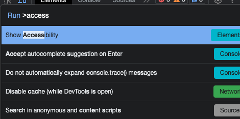
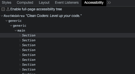
A tree structure and element details are also displayed in this panel, which illustrates how screen-reading software reads your webpage. This will allow you to determine whether an element is appropriately descriptive for someone using a screen reader or other device, as well as how it is narrated, and in what order it appears. Consider personally using a screen reader to test your website if you want to take it a step further. This feature is already included in the majority of operating systems. Navigating through your website with your eyes closed, relying only on the screen reader's voice and your keyboard's tabs and hotkeys, can provide you with that same user experience you're offering to your visually impaired visitors.
A picture is worth a thousand words…but words are still needed (for those who can’t see)
If you were using a screen reader and came across an image that can’t load, you would encounter a void in the content that prevents you from accessing it and disconnects you from the page's overall purpose. This only happens if the "alt" attribute isn’t present. This gap is filled by that attribute, which gives people who can't see the image context. When utilizing “alt”, the following are recommended practices:
Be descriptive: Provide a succinct and understandable description of the image in your "alt" text. If the image contains text, the "alt" attribute should include the same words.
Be relevant: Avoid loading the "alt" text with unnecessary details that detract from the image's main point.
Avoid redundancy: If the image is purely decorative and adds no additional information to the page, an empty "alt" attribute (alt="") is recommended to avoid redundancy for screen reader users. Don’t use text saying "image of..." or "picture of...".

It should be noted that context matters when using this attribute. For example, on an art site, you may want to provide more detail to convey the style, mood, and composition, as these components are needed to best understand and appreciate the artwork.
<div>
  <img src="painting.jpg" alt="Oil painting by
  Harald Sohlberg titled 'Winter Night in the
  Mountains', depicting a vivid, snowy landscape
  dominated by a large red house with a church
  spire in the background, all set against a dark,
  cloud-filled sky.">
</div>
For a more utilitarian site, it is best to keep the alt text short, as it mostly focuses on the function and relevance of the image to the content around it.
<div>
  <img src="painting.jpg" alt="Snow-covered houses">
</div>
Keyboard Navigation
Users should be able to navigate through all interactive elements in an application by using the 'tab' key to move forward and 'shift + tab' to move backward for the best keyboard accessibility. The 'enter' or 'space' bar should be able to be used to activate interactive elements such as buttons or dropdowns. When dropdown menus are present, arrow keys ought to make it possible to navigate through the available options.
Always utilize the correct input controls, such as buttons, anchor tags, or form elements, for creating interactive elements. These are specified in HTML standards and supported by browser implementations to provide basic keyboard functionality right out of the box, eliminating the need for extra development work.
<!-- correct use of a button -->
<button onclick="alert('You clicked me!')">Click
Me!</button>

<!-- incorrect use of a div as a button -->
<div onclick="alert('You clicked me!')">Click
Me!</div>

<!-- correct use of an anchor with href, which
is focusable and can be activated with the
keyboard -->
<a href="#content">Skip to content</a>

<!-- incorrect use of a span as a link -->
<span onclick="location.href='#content'">
Skip to content</span>
For instance, when you use a button element, it is automatically focusable and can be activated with the ‘enter’ key by default. This is because browsers are built to recognize these elements as interactive and to provide them with certain accessible features. This is another advantage of using semantic HTML! It ensures accessibility for free. Therefore, it isn’t recommended to use non-interactive components like "divs" in place of interactive features. This is because different states like hover, active, and focus are naturally understood by semantic elements. The focus state should always be clearly visible, indicated by a focus ring or outline to signal the active element.
Events that rely solely on mouse interaction should especially be avoided. Instead, make sure that all events can also be triggered via the keyboard, providing equal functionality for all users.
UX Design
Color Contrast
The spectrum of visual impairments stretches from total blindness to partial vision loss. Luckily, this demographic can easily access digital content thanks to already established standards. A crucial aspect of these standards is the color contrast ratio, which defines the difference in luminance between the text (or a focal element) and its background, ensuring that important content is always distinguishable and readable.
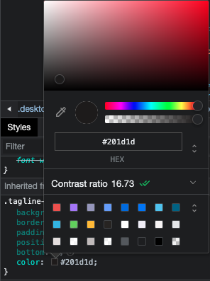
To guarantee that text is easily readable, the Web Content Accessibility Guidelines (WCAG) offer recommendations for color contrast ratios. For instance, larger text should have a minimum contrast ratio of 3:1, whereas standard text should have a minimum ratio of 4.5:1. By clicking on a text element's hex color code, you can check the text-to-background contrast ratio right in your inspector.
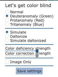
Red-green color blindness is one of the most common kinds, so try to keep that in mind when selecting colors for your UI. I use the browser extension "Let'sgetcolorblind" to check if designs remain clear for people with different color perception levels. With this tool, you can examine your designs in various color blindness scenarios and make sure that the context of certain elements is still understandable in any hue or tone.


When color blindness could compromise clarity, incorporating icons and additional contextual elements may be helpful as well.
An Accessibility Checklist
Typography
- Use a minimum font size of 16px for body text
- Limit line length to 50-60 characters on desktop. On mobile, limit it to 30-40 characters
- Don’t forget to set your line height
- Avoid light text weights
Color and Contrast
- Use high-contrast color combinations with a minimum contrast of 4.5:1
- Avoid problematic color combinations, like red and green, as much as possible
- Reinforce color choices with contextual patterns, icons, and labels
Navigation and Interaction
- Plan a clear and linear visual layout
- Make links look like links
- Keep button and link text short and descriptive
- Make buttons and interactive elements large enough and easy to tap
- Separate touch elements with clear space
- Provide visual and interaction cues for better understanding
- Use labels rather than just placeholder text for clarity in forms
- Allow layout to be zoomable and scalable
- Include transcripts and captions for audio and video content
Conclusion
Even though our everyday environments still have significant structural flaws that limit people with disabilities, as developers, we can take steps to remove the barriers that they face online. The need to integrate this accessibility into both our digital and physical spaces is not necessarily about compliance or ticking off boxes on a checklist—it's about upholding the dignity and autonomy of every individual and striving towards a world where people can live freely and independently to the best of their ability. When we forget to consider the wide spectrum of human abilities, we unknowingly contribute to an environment of exclusion. This is one that not only restricts the individual, but also degrades society by stifling the contribution and potential of all its members.