In Joe Dante's Gremlins (1984), mogwai are cute and harmless creatures until the conditions around them change. Mogwai come with three rules: keep them out of sunlight, don't get them wet, and never feed them after midnight. Break a rule, and the creature you thought you understood becomes something else entirely.
The same is true of your users. And as UX designers, we're the ones leaving food out after midnight. Most users want to do a normal thing. Then the network drops mid-submit, a form quietly clears their input, and suddenly they're rage-clicking, edge-case-triggering, support-ticket-filing gremlins. That transformation is almost always the design's fault.
Most designers optimize for the happy path: the imagined median user, doing the imagined median task, in imagined median conditions. However, the unhappy paths — the error states, the edge cases — are where the best designs prove themselves. This is what's sometimes called defensive UX: designing not just for the user you imagined, but for every user you didn't.
Good design, then, means anticipating the gremlins before they arrive. We'll follow one example through the rest of this post: the signup form. Innocent on the surface (a few fields, a button, a welcome email), and also where most products lose users before they ever become users.
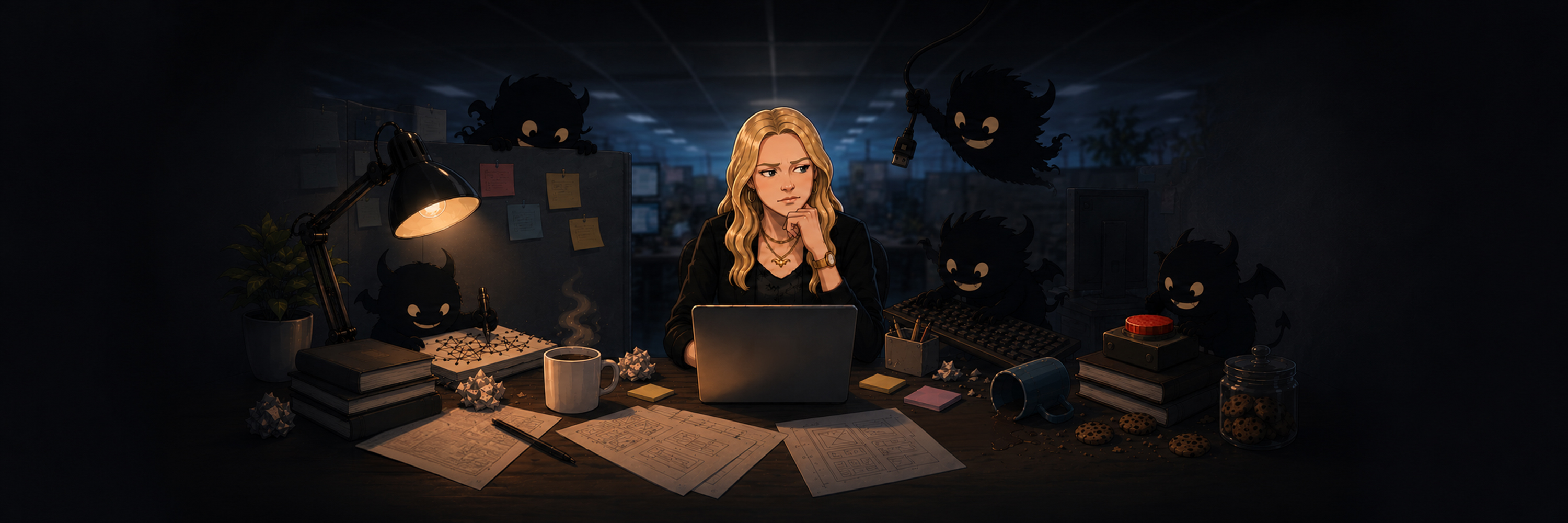
What Creates a Gremlin?
Gremlins aren't a user type; they're what users become when a design fails them. Understanding what creates each type of gremlin is the first step toward defensive UX design.
In a designer’s head, the signup form has five fields and takes ten seconds. In reality, that same form receives a name that literally reads "Null," unexpected pasted formatting in the name input, a flaky 3G connection mid-submit, a 10,000-character paste, trailing whitespace on inputs, and a double-click on submit. The form created the gremlin.
These examples fall into three categories of gremlins: the Accidental Gremlin (the user who fumbled), the Adversarial Gremlin (the user who probed), and the Environmental Gremlin (the user whose conditions betrayed them). Some of the examples that follow are pure design considerations; some live in code, but thinking about these scenarios and communicating the intended user experience is the designer's job either way. We'll go over each one and what to look for in your designs, so the gremlins can't wreak havoc.
The Accidental Gremlin
A user signs up on their phone. They copy their email from their contacts app and paste it into the form. The paste includes a trailing space they can't see. They tap "Sign Up". The form rejects "nicole@example.com " as an invalid email. The user stares at "nicole@example.com " on screen, doesn't understand why it's incorrect, assumes a bug in the system, and abandons the signup.
Designers ship for the user they imagined. That user has an average-length last name, an email with no special characters, and types one character at a time into the field they're supposed to. The real user is on a phone, in a hurry, pasting from somewhere else, and statistically guaranteed not to match your assumptions.
Design forms to tolerate harmless mistakes before rejecting input — this is where good form validation UX starts. An email copied from another app may include trailing whitespace. Names contain apostrophes and accents. Emails contain + signs. If your form rejects something real users type, the form is wrong, not them.
Get in the habit of designing all states of every field (empty, loading, error, and ideal), because most designers ship the ideal state and assume the rest. Designing error states explicitly — not as an afterthought — is what separates robust user experiences from fragile ones. When every state is covered, your intent reaches developers as a spec, not a guess.
Any time you write a validation rule, ask what real input it might reject. Any time you set a character limit, ask whose real name or address won't fit. Any time you assume a field's shape, think of one real user it excludes.
The Adversarial Gremlin
A user creates an account with a display name that's 200 characters long and made of Zalgo text, letters with marks piled five and six deep until they smoosh into the lines above and below. The name renders fine in the signup form, where the field has its own container. When they post a comment, their name pushes the comment header off the side of the screen, the diacritics overflow vertically into the comment above it, and the page layout breaks for every user viewing the thread.
This user is testing the limits of what your product can display, not just what the form can accept. The form looked correct in isolation, but nobody asked what would happen once that content appeared elsewhere in the interface.
There are countless variations: a username like "Admin" or "Support" registered to impersonate staff. A lookalike username that reads identically to an existing trusted account. A 50,000-character bio that crashes the profile page.
Constrain user-generated content at the design layer, not just the data layer. Set sensible length limits in the UI and enforce truncation everywhere the content renders.
Treat user-generated content as unpredictable, and design layouts that remain stable when content stretches beyond expectations. Products should account for impersonation-prone usernames ("admin," "support," your own brand name) and consider how visually similar usernames might confuse other users.
Any time you accept user input that will appear somewhere else, ask what happens when it exceeds the assumptions the interface was designed around. Any time you render user content, ask what surface it can break. Any time you reserve usernames, think about the variations: lookalike characters, capitalizations, transliterations.
The Environmental Gremlin
A user opens your signup form on the subway. They fill in their name, email, and password. The train hits a tunnel right as they tap "Sign Up". The form shows "Something went wrong, please try again," scrolls back to the top, and clears every field. When the train re-emerges from the tunnel, they're staring at an empty form. They give up.
The user did nothing wrong. The environment turned them into a gremlin. Designs built in the office, tested on staging, demoed on a 27-inch monitor with full connection and good lighting, then shipped to phones in pockets on trains in tunnels in direct sunlight one-handed while holding coffee. The conditions the design will face are not the conditions the design was made in.
There are countless variations: pale gray placeholder text invisible in direct sunlight. A "show password" toggle three pixels across that nobody can hit. Form fields that lose their input when the user switches apps to check the verification code.
Design for the worst plausible conditions, not the best. Treat WCAG contrast ratios as a baseline: pale gray text looks elegant in Figma and disappears in sunlight. Make every tap target at least 48×48 px, including "show password" icons and checkboxes. And never silently lose input. If the connection drops, queue the request and show recovery — good error handling UX means the user always knows what happened and what to do next.
Any time you design a screen, ask what it looks like in the conditions users actually see it in. Any time you submit user input, ask what happens if the network drops and the user can't tell.
Designing for Gremlins
The ideal path is one design. The real paths require designers to imagine the edge cases: a user who fumbled, a user who probed, and a user whose train hit a tunnel. Most of the work of good UX happens in those three scenarios, not in the one you demoed.
So before you ship, run your design through the three questions this piece has been asking all along. What harmless mistake could it reject? What unexpected input could break it once it renders elsewhere? What happens to it in bad light, on bad networks, in different locations? The conditions your design will face are not the conditions your design was made in.
Designing for the mogwai is easy. Design for the gremlins.
If you want to take edge case design further, try running your interfaces through real users in unexpected ways — Nicole's earlier post on the haunted house approach to usability testing is a great place to start.
FAQ
What is defensive UX? Defensive UX is the practice of designing interfaces that remain functional and user-friendly when things go wrong — bad input, hostile content, dropped connections, harsh lighting. Instead of only designing for the ideal scenario, defensive UX anticipates the edge cases that turn users into gremlins.
How do I design forms for edge cases? Start by designing every state of every field: empty, loading, error, and ideal. Trim whitespace, accept real-world characters (apostrophes, accents, + signs in emails), and set sensible length limits. Ask what real input your validation might reject, and test with pasted content, not just typed input.
What are common form validation UX mistakes? Rejecting valid input (trailing whitespace, special characters in names), clearing fields on error, showing vague error messages like "something went wrong," and failing to preserve user input when the network drops. Every one of these turns a normal user into a frustrated one.