This article is the fourth in a series about improving your workflow as a graphic designer by borrowing from the toolbox of front-end developers. In general, HTML & CSS are easy to change, whereas files for print documents are not. In this episode, we will be examining how the links panel in InDesign relates to web development, and how we can maximize its use to make our InDesign documents easier to change.
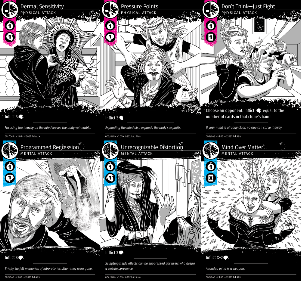
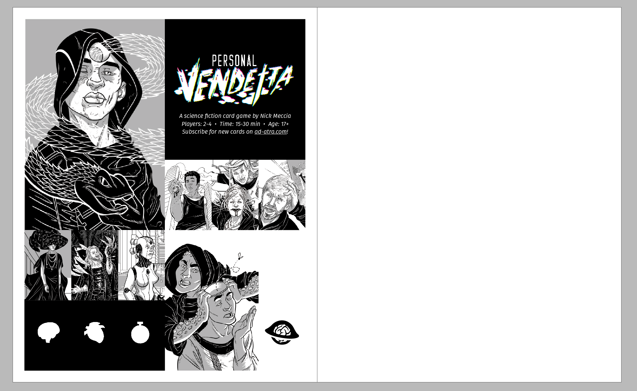
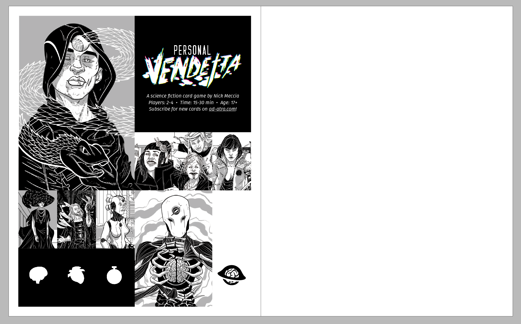
This article will be using examples from my card game Personal Vendetta, which is available as a free print-and-play download from https://ad-atra.com.
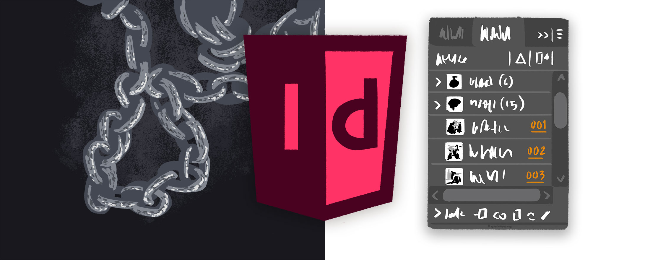
The Links Panel
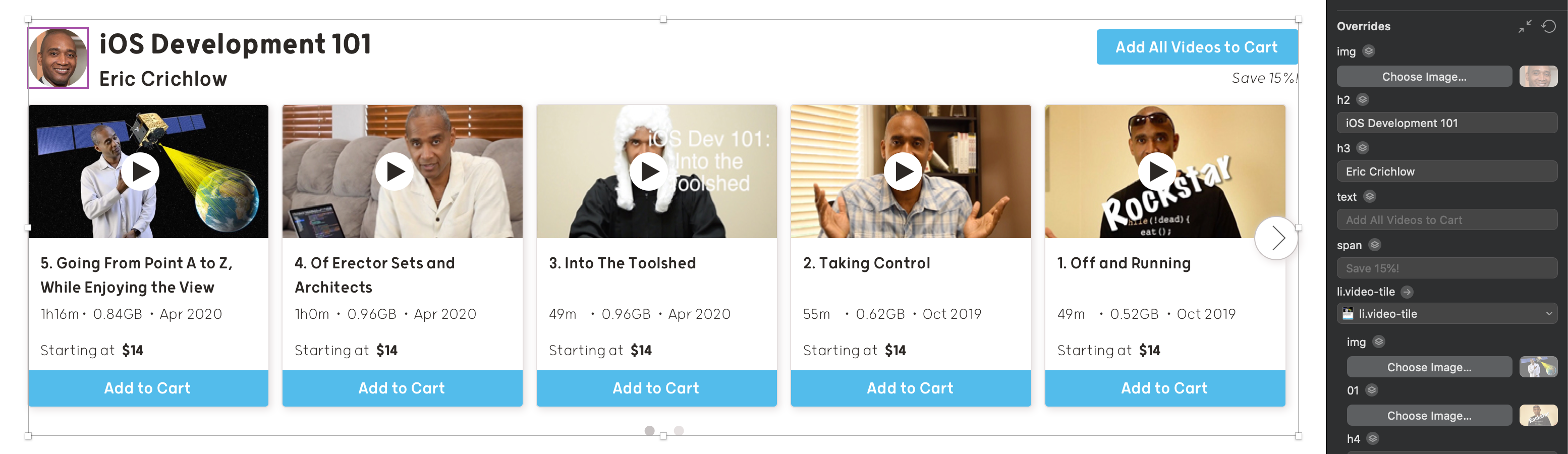
One of the biggest selling points of CSS is that a single style can encompass many items on a webpage, saving you the time of applying your design to each item individually. For example, all four photos depicted here are styled by the same code.

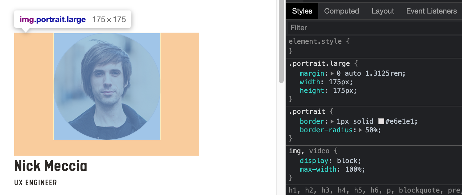
One of the most useful features of Sketch is the instance, which captures a group of objects for you to reuse throughout your document in a similar manner to CSS. Use an instance's overrides to edit copies of a design without modifying the original. In this example, I can swap in new author photos without needing to apply a circular shape mask each time.
Unfortunately, InDesign doesn't have any features which rival the full scope of CSS classes or Sketch instances, but its treatment of images is equally as powerful and starts with placing instead of pasting.
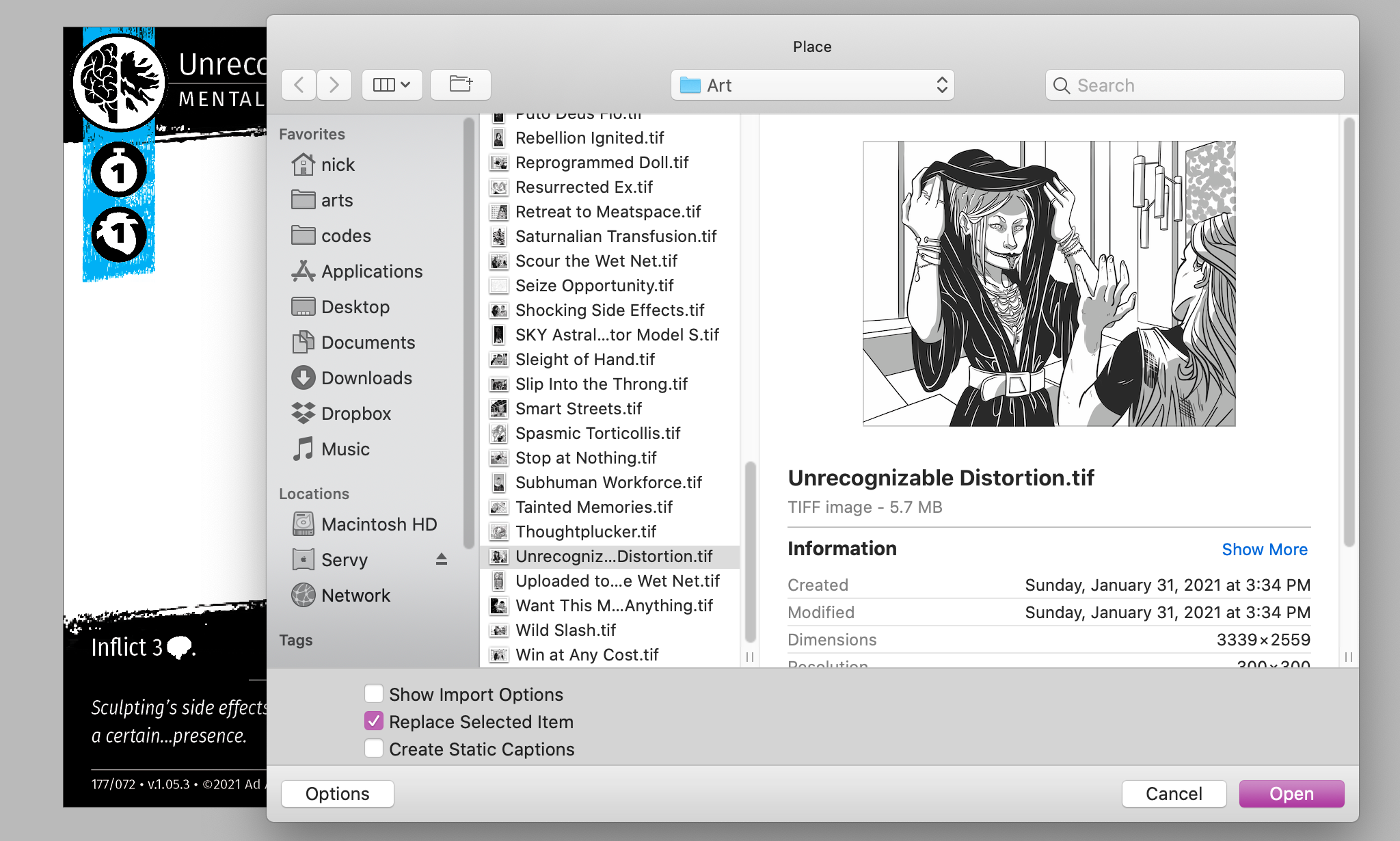
For most of the small, quick InDesign projects I've completed in the past, I was too lazy to use the place feature (⌘+d), opting instead to simply copy (⌘+c) rasterized images from Photoshop or vectors from Illustrator and paste (⌘+v) them directly onto a spread in InDesign. Unlike pasting, placing requires you to locate an image in Finder, and InDesign will remember the path to that image.
My past self would frequently rearrange my projects' directory structures, which broke all of my image links. Here is an example of the punishment I received:
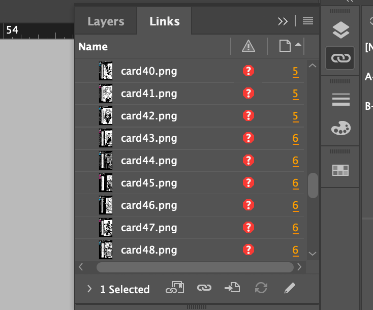
InDesign can't find any of these files, so now I have a limited ability to export my project. To prevent the annoying maintenance of re-linking each image individually, I opted to simply paste images and vectors directly into InDesign instead. The differences between placing and pasting are slight, but have significant impact if you want to take your workflow to the next level.
One negligible difference is that a pasted image increases the size of the INDD file, whereas a linked image does not. Since an InDesign file can't be sent to print without all images present in its package, you're not actually saving space — just relocating it. However, for a larger project with variable components begging for Sketch instances, maximizing link organization will give you the same flexibility as Sketch, without sacrificing precision.
In order to really emphasize the impact links can have over your document, let's examine my first draft of Personal Vendetta's card design.
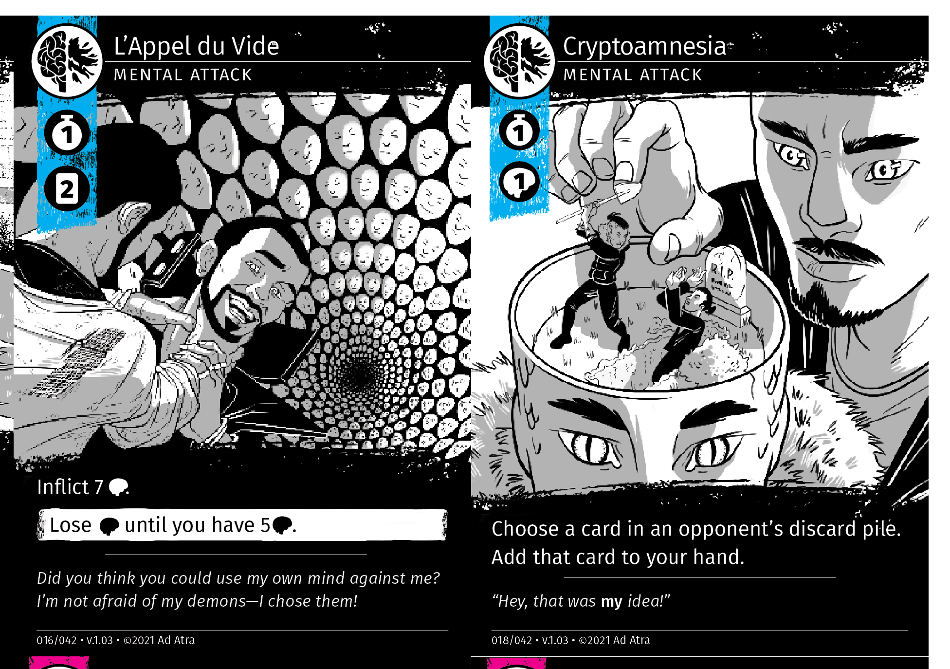
At first glance, everything in this screenshot appears shipshape. However, zooming in more closely reveals a few aberrations...
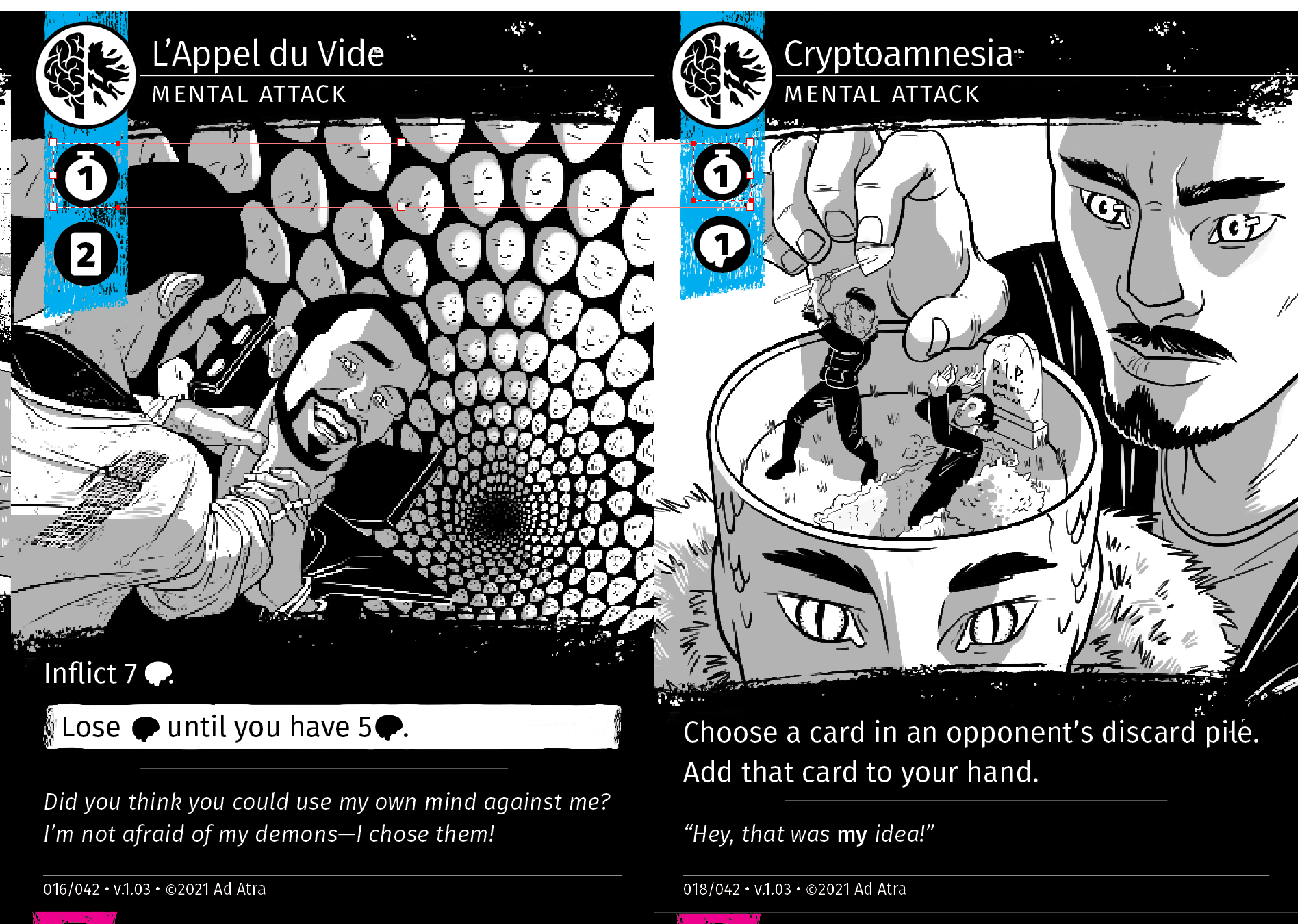
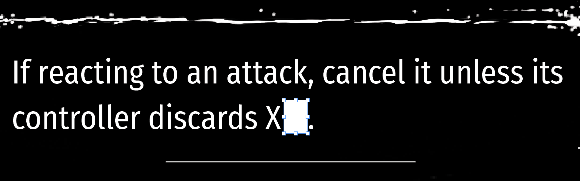
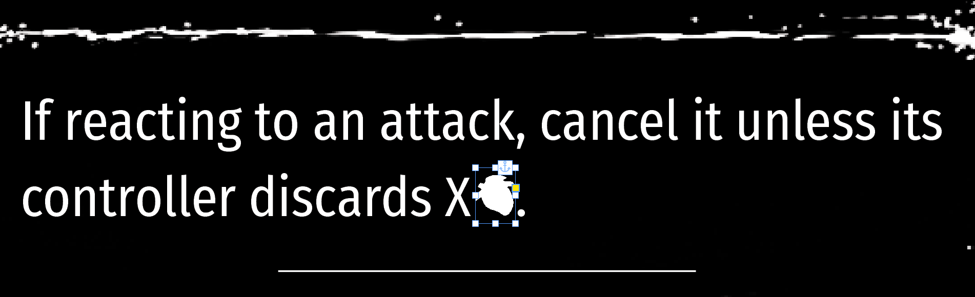
It's difficult to see, but the highlighted icons are actually two different sizes! In addition, the space and alignment of the icons in the text frame are also off.
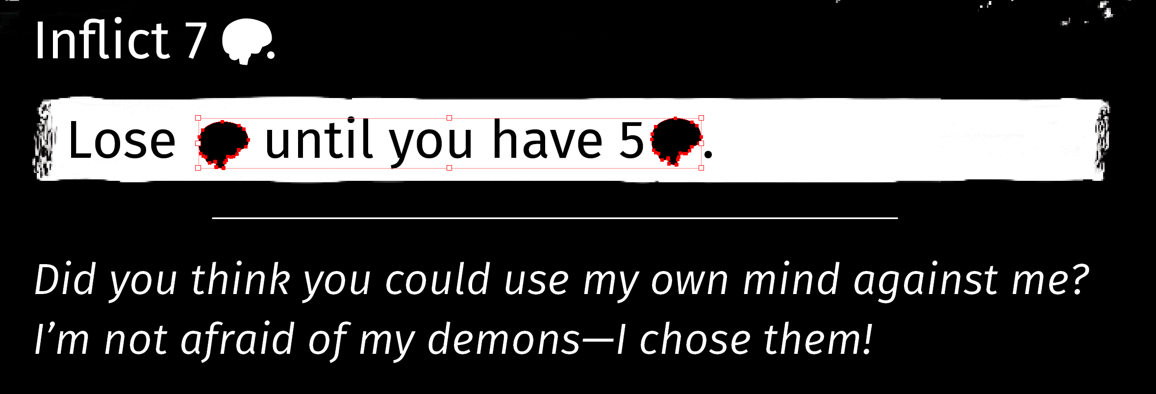
How could I have made so many mistakes? Copying and pasting. The icons were copied and pasted from Illustrator, and I misremembered the width and height for the icons on the left card. The icons in the text are misaligned because I copied and pasted each one on top of the text frame instead of inside the text frame. Furthermore, each card in this document was created by copying and pasting an existing card, then copying and pasting new content on top of it. At certain points, when my alignment was off by a fraction of a pica, the errors propgated into each subsequent paste, compounding into a mess of inconsistencies that only manual attention could fix.
In the latest INDD for my card game, each card now occupies its own page, but especially relevant to the discussion at hand is how I now add new content by placing rather than pasting. For starters, let's check out the directory structure for my newest project file.
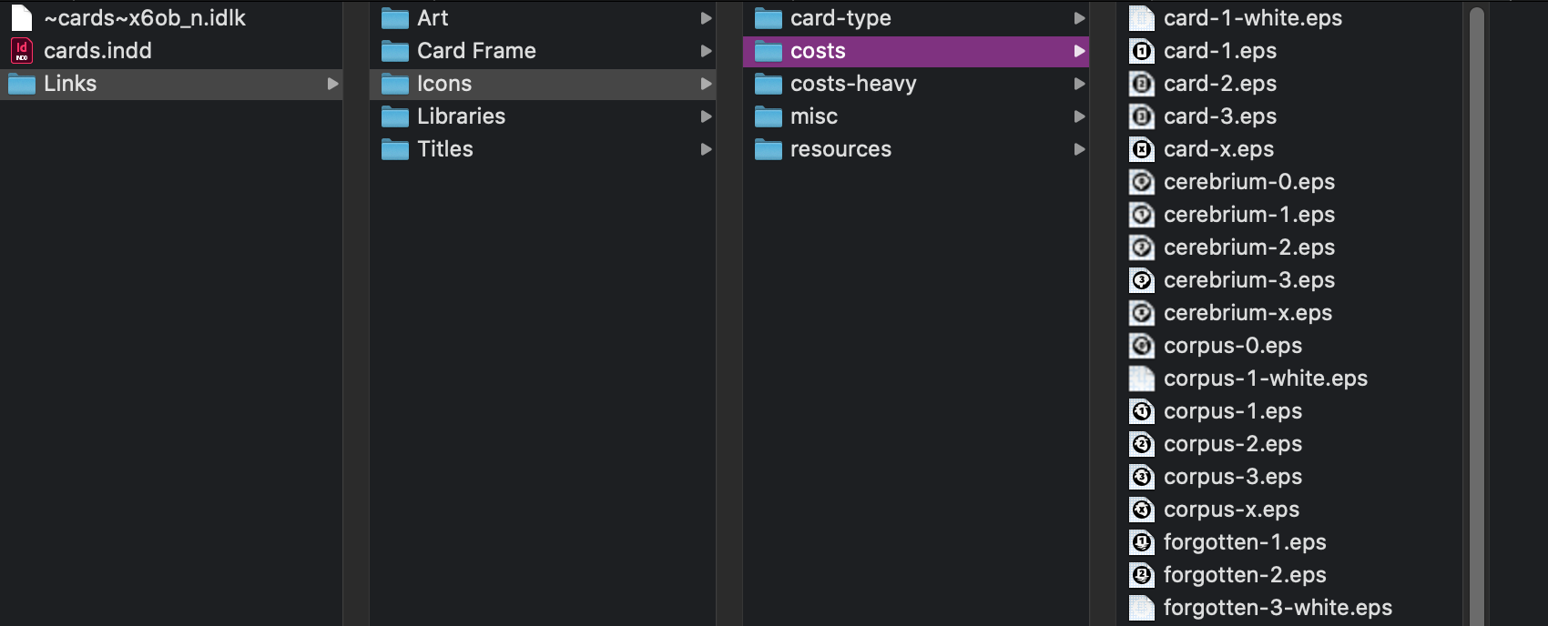
It's a work of art. This tree looks like the public directory of a web app, and it makes placing files very convenient — even more convenient than copying & pasting. Sketch overrides are decided in the sidebar, but think of InDesign's placed content as overrides which are decided in Finder.
Links in Practice
Maximizing the potential of links isn't as obvious as tapping into the power of Sketch's instances — after all, InDesign's links only apply to images. However, there are more ways to set up your document to reduce friction than you may have realized. Here are some examples.
Easily Change Your Mind on Layouts and Images
InDesign is unforgiving to designers who work simultaneously on the design and content of their project, as changes are more difficult to make in Adobe's software than in code. When you don't have a solid grasp on your layout, creating placeholder frames to later fill with images will save you time over copying and pasting.
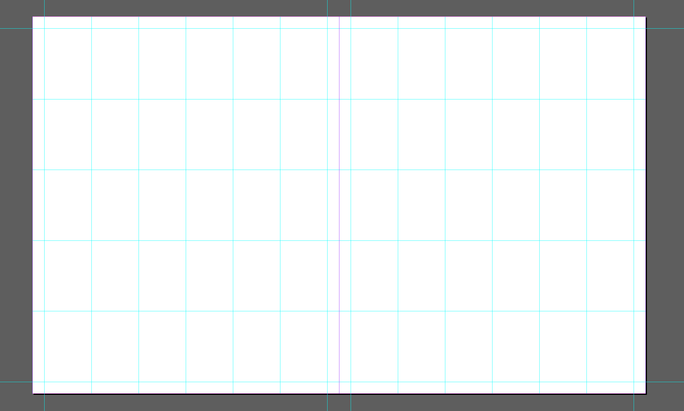
Here is a familiar layout from the world of print — a grid of images.

I want to use this layout as inspiration for an advertisement for my card game. If I begin my design by pasting and arranging images, I'll duplicate my effort each time I need to swap out an image or move an image to a new location. Here's how to save time by placing images: first, decide upon a grid.
Next, place empty frames.
I'm not entirely happy with this direction — I want the main image to pack more of a punch. Good thing I didn't commit to any images yet...
Much better! Now I can place images into each frame pressing ⌘+d, choosing an image from Finder, and clicking on the desired frame.
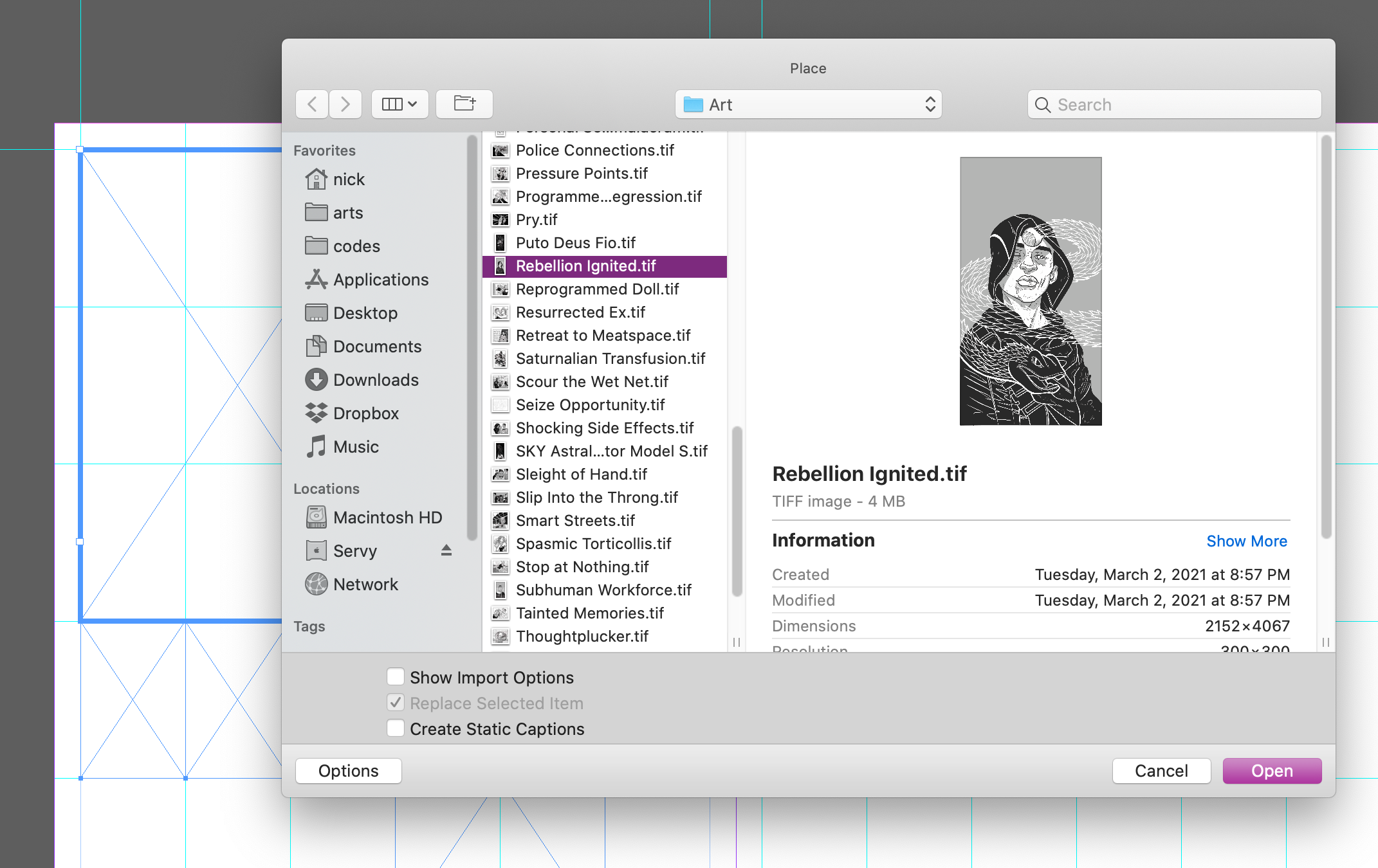
In fact, I can place all of my images at once! How convenient.
Here is the final layout!
Or...is it? I've changed my mind about a few of these images. All I need to do is highlight a frame and press ⌘+d to replace its image.
Filling frames with placed images allows you to easily pivot on layout and content choices over copying & pasting.
Automatically Update Linked Files After Revisions
As I'm sure many readers can relate, the harshest critic of my work is...myself. The more time elapses between finishing an illustration and viewing it in InDesign, the more likely I am to make corrections. Here's a card I finished some time ago:
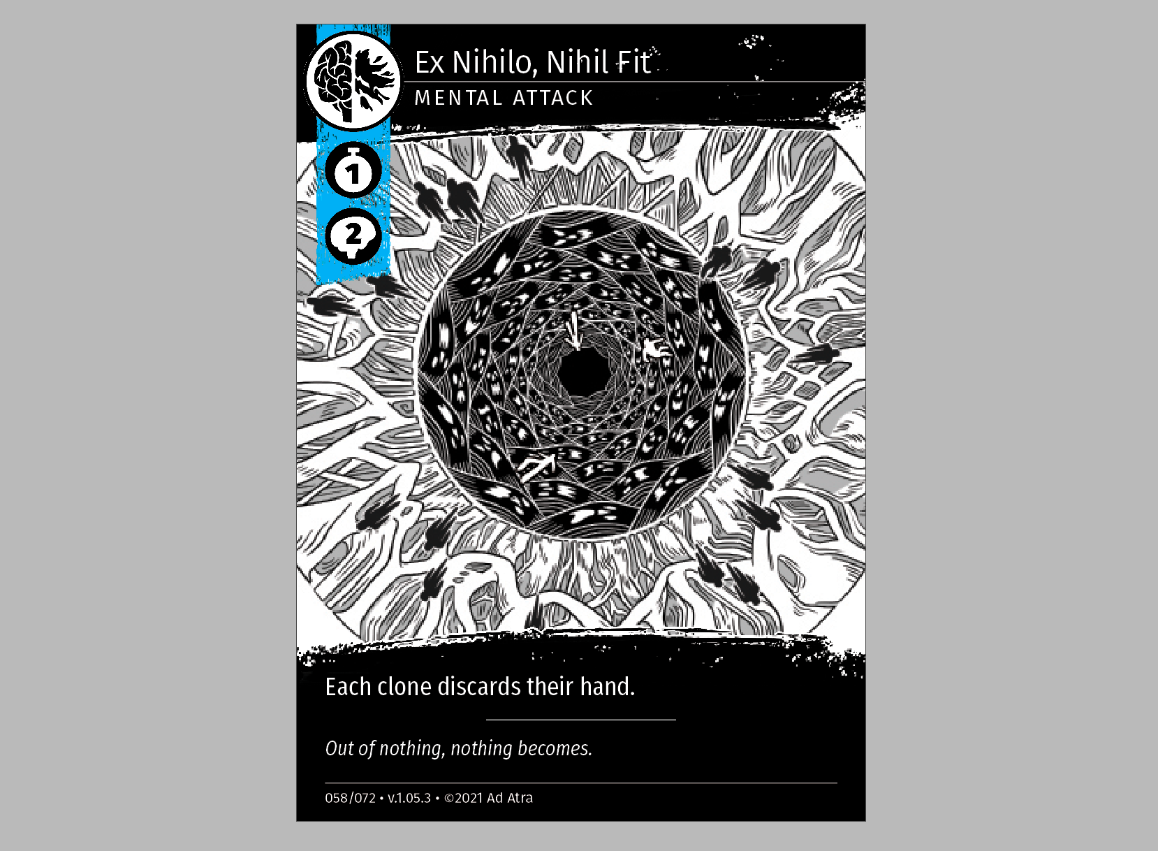
It looks pretty good...except, the detail in the center is too bright. This image is supposed to be a close-up of an eye, and I don't think the pupil is dark enough for viewers to understand what this image is about. I updated my art, and saved it under the same file name.
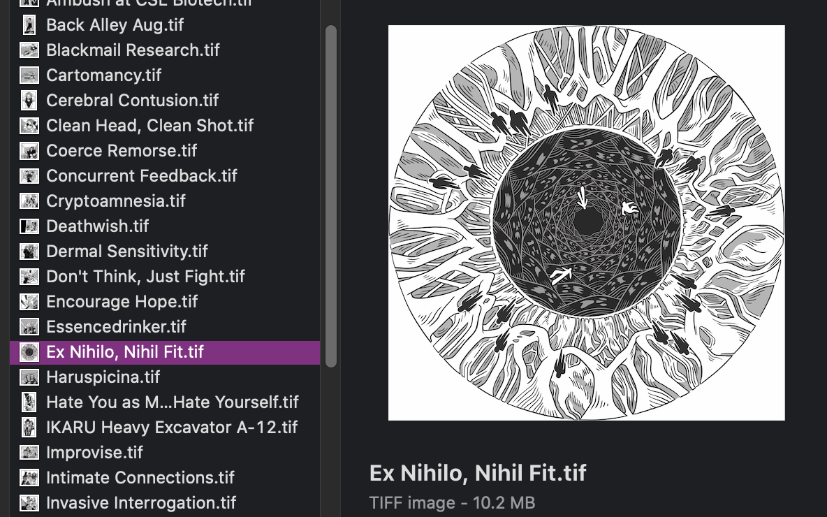
Looks better! However, the links panel in InDesign now shows an error icon.
This means that InDesign recognizes that the file has changed. When I double-click this icon, InDesign updates the link and displays the new image!
For a person who frequently revises images, links are a lifesaver.
Wrangle an Excess of Options
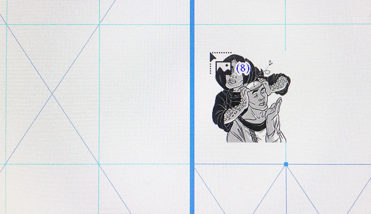
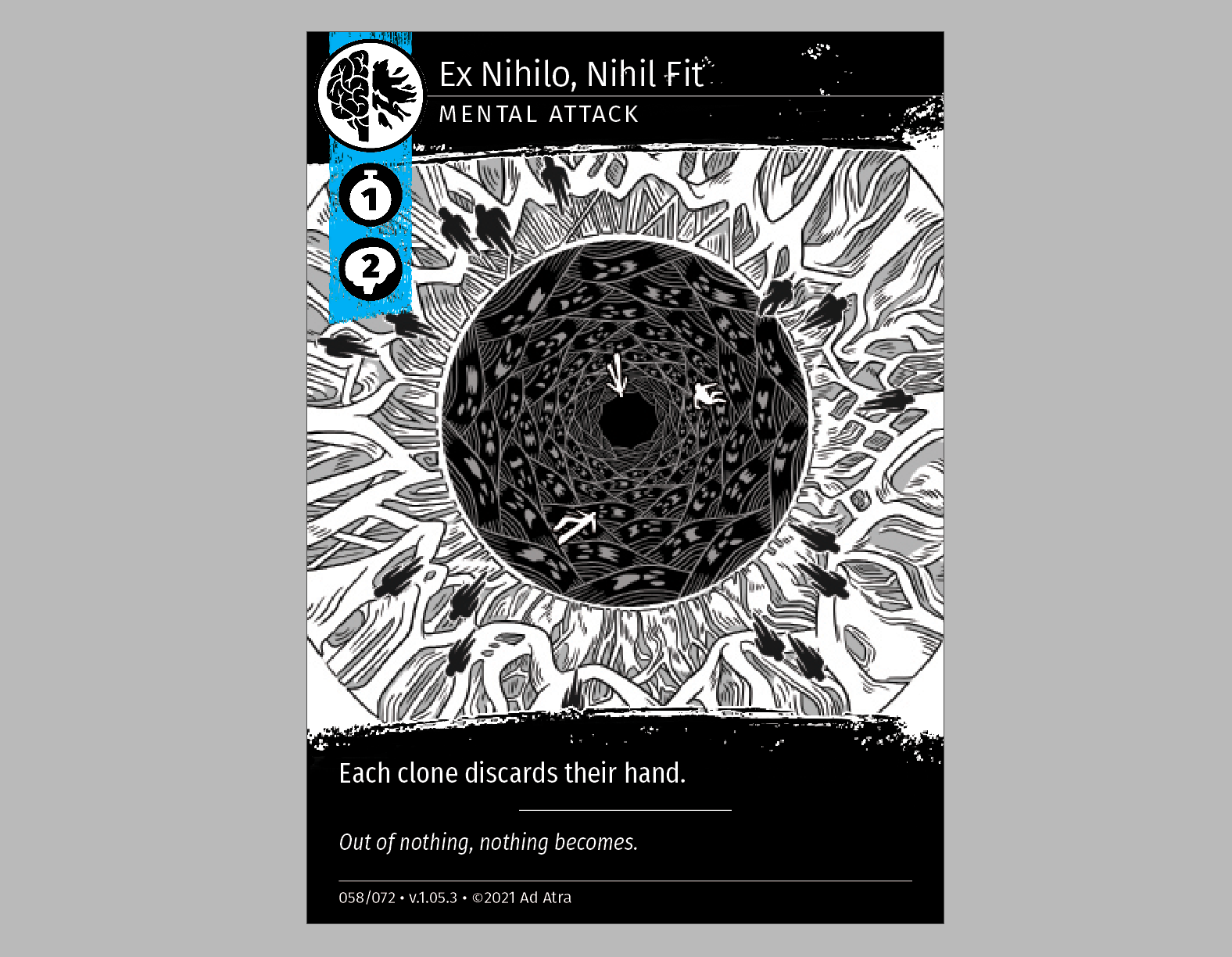
Each playtest of my card game inevitably reveals something that needs changing. Take this card, for example:
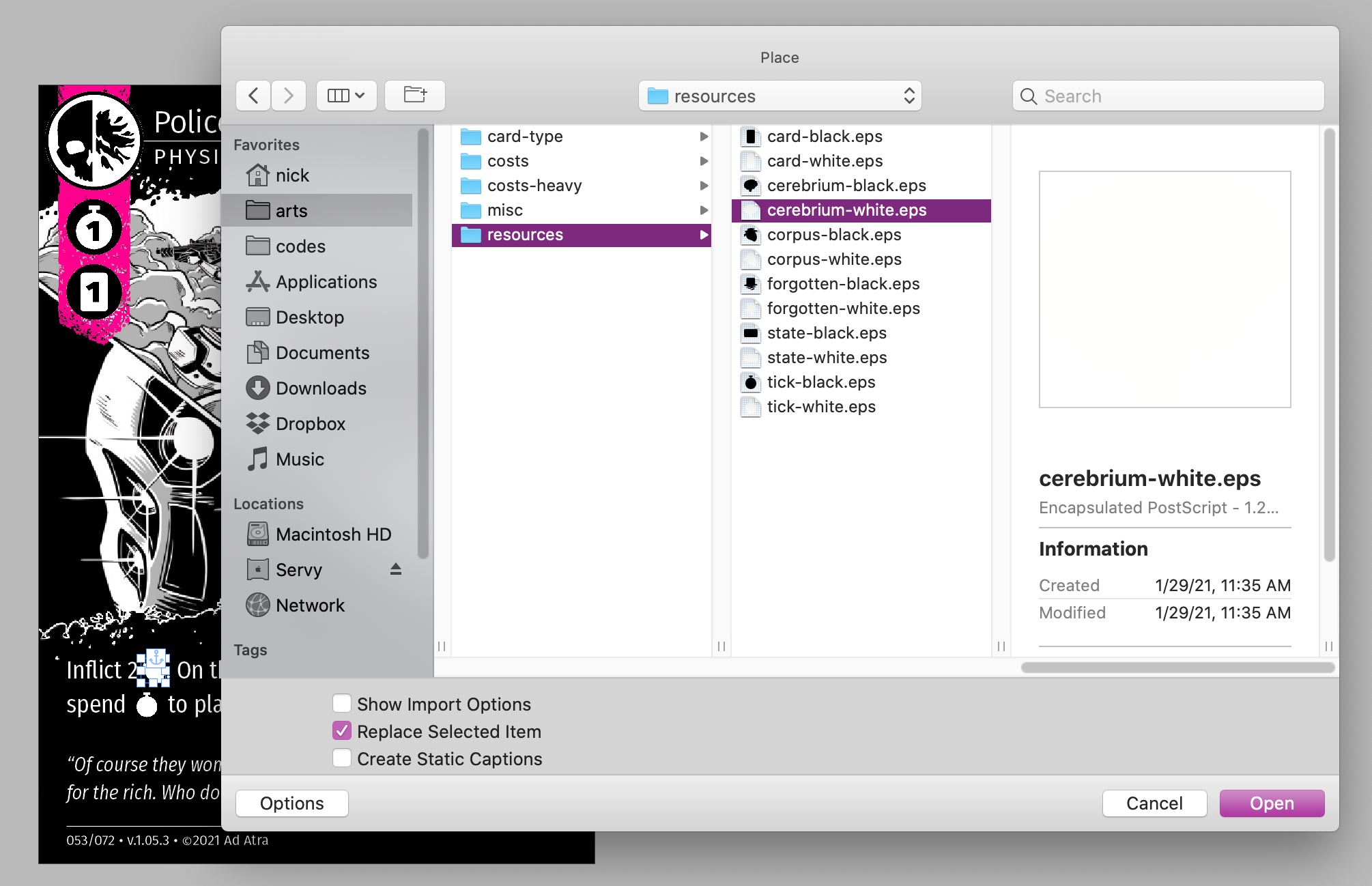
Its cost is a bit low. If I want to change an icon in its cost, all I need to do is select the icon I wish to change, then press ⌘+d to replace it with a different icon.
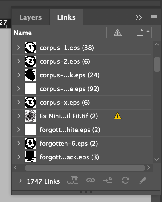
My cleverly-curated directory of icons makes this update very simple!
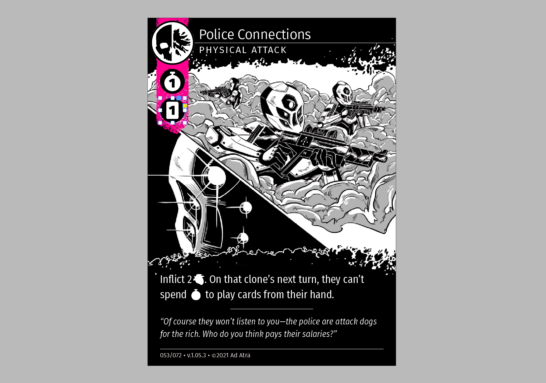
I use the same technique to manage the myriad of inline icons which pepper the text of each card as well.
However, most users of InDesign (and readers of this article) are not making card games. As a more relatable example, here is a design from a magazine which would benefit from a similar treatment of its icons.
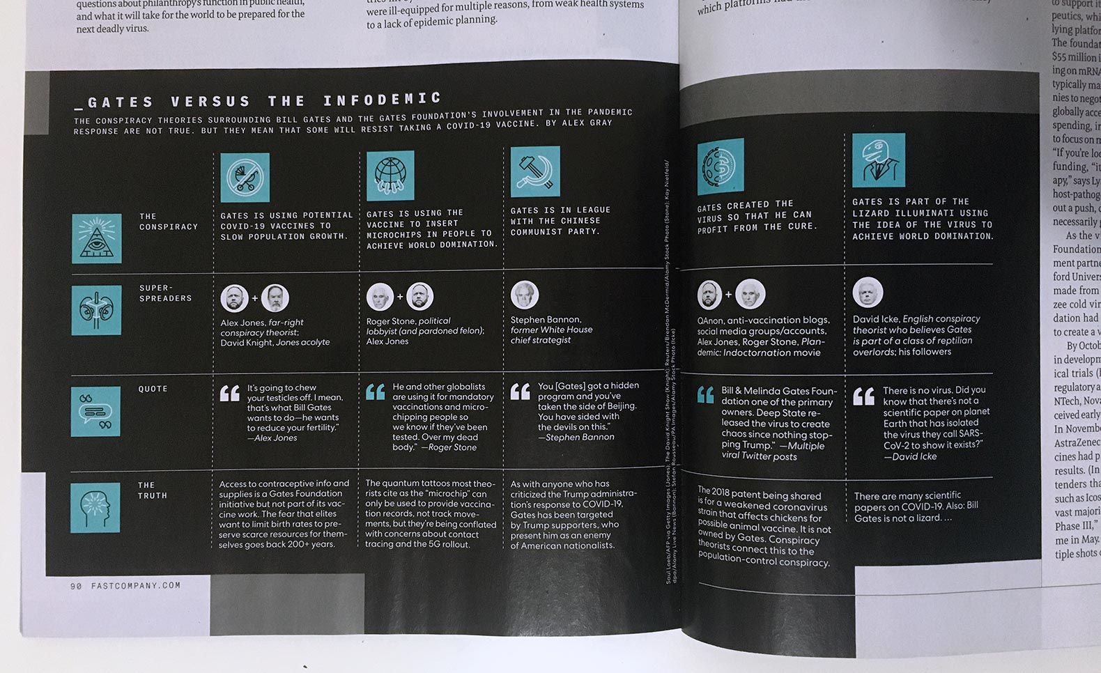
Any design which features different images occupying the same space can benefit from a well-organized directory of links.
Fit Irregularly-Sized Objects Into Standard Containers
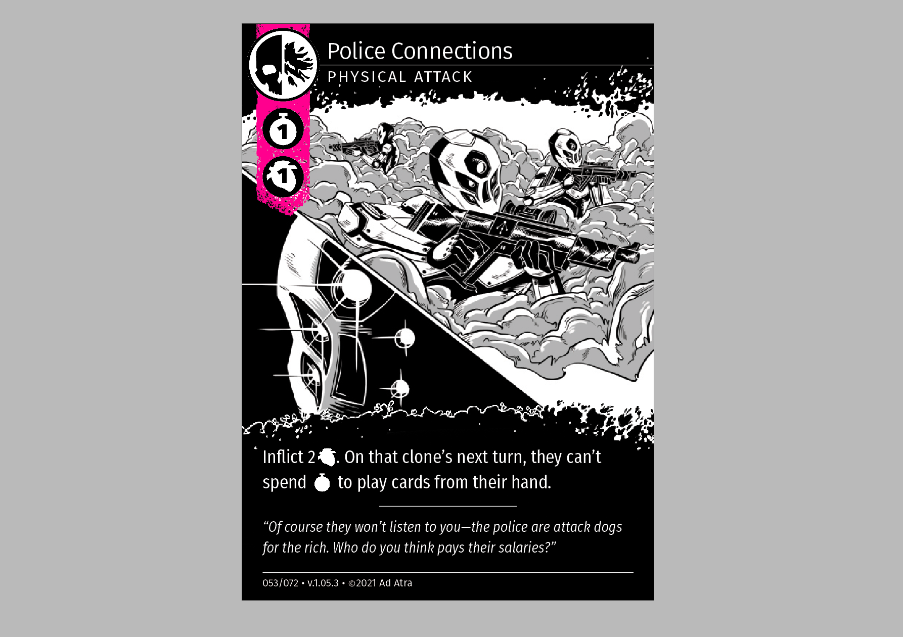
Personal Vendetta uses several icons interchangeably, but they are unfortunately not the same dimensions.
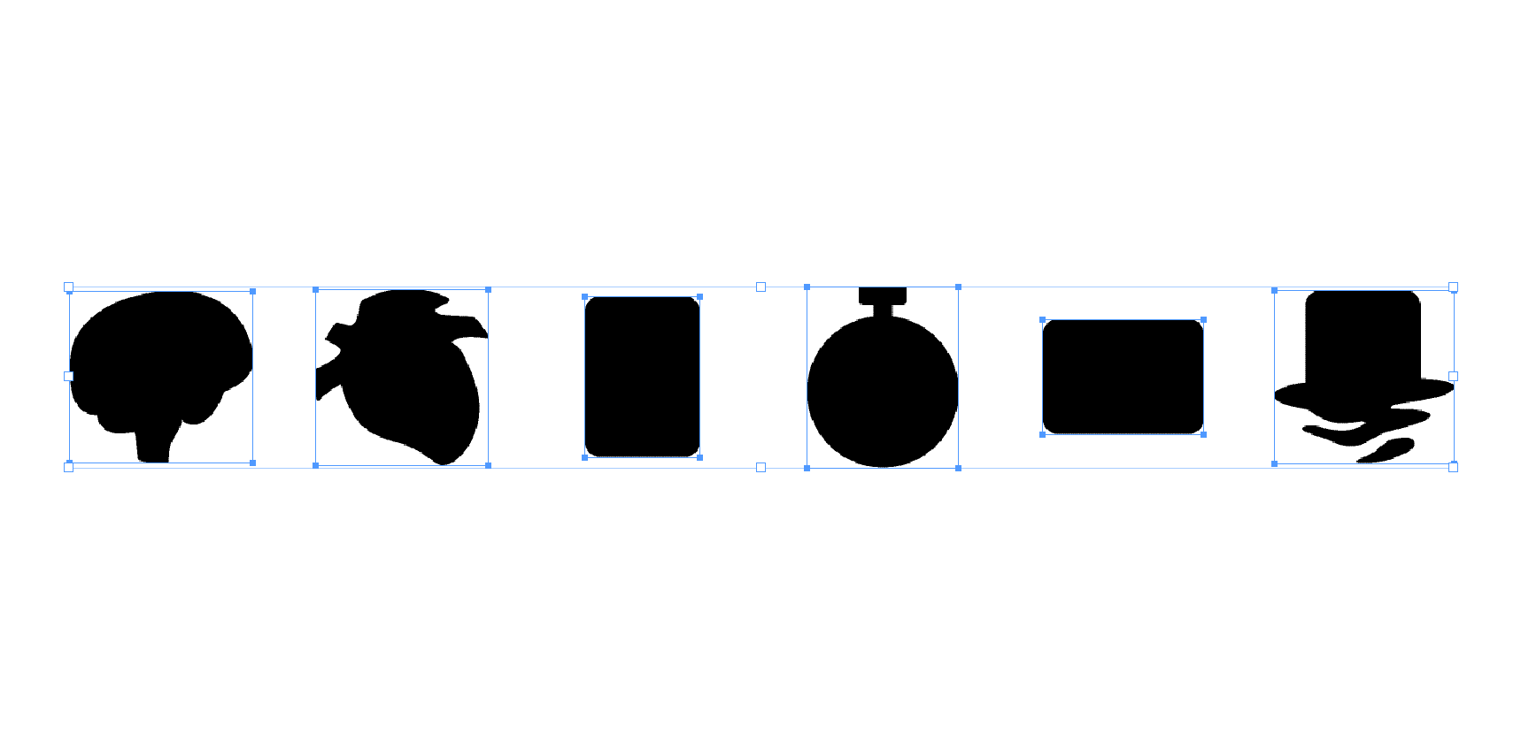
This makes for an annoying experience when swapping a new icon into the wrong frame.
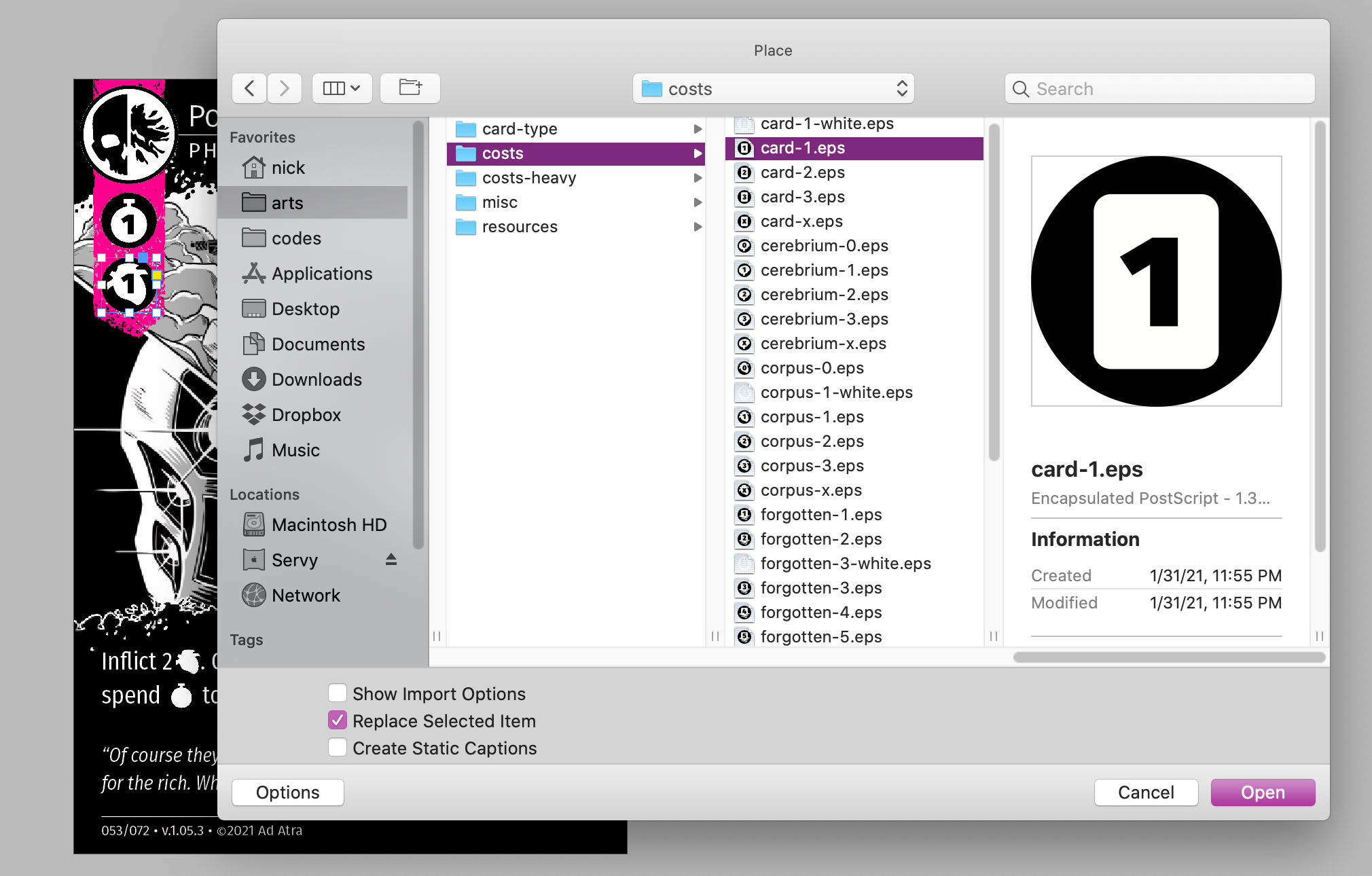
The new icon is too small! I want it to be the same size as the original icon. Maybe if I select a different fill option...

This looks even worse! I could save each of my icons as a square PNG with transparency, but it makes equal sense to save my icons as EPS images so that the color can be changed from within InDesign. EPS documents don't save the artboard size, so either I'm stuck with irregularly-sized images or a giant links directory with every possible permuatation of color.
What I really want are EPS files with a square footprint. Fortunately, I can achieve this effect by managing the dimensions of the frame instead of the dimensions of the image. All I need to do is resize my frame into a square.

Now I can fearlessly place a new icon, relying on fill options to position the new image (unlike before).

Perfect!
In Summary
While InDesign may have been built for content compilers, content creators can save themselves time and frustration by smartly organizing a directory of links to draw from, rather than copying and pasting content into their document.